
Every year, digital industry trends change and new technologies emerge as never before. As you know, design is also a very essential part of every brand or service. According to statistics (Top Design Firms), 50% of all online consumers consider website design to be the most important component in choosing a product or service.
So it makes sense to periodically update your website or landing page, isn't it?
E-Groshi is a Ukrainian microcredit company that is popular because of its round-the-clock services, does not require a lot of data, and quickly issues loans, showing its loyalty to the clients. The company also provides a convenient system of interest accrual and the opportunity to calculate the loan amount independently. E-Groshi also does volunteer work and offers loans for a wide variety of amounts. It assures that a customer can get a loan in as little as five minutes. Such a result requires a quality site that is quick to load and also convenient for such operative features.
About the Client in Short
The finance company E-Groshi is well aware of the importance of a good website design, so in August 2021 they asked WEZOM for help. The request was to refresh the existing site. We quickly responded to the request and the cooperation was started. Let's find out what kind of challenges the WEZOM team faced and what results we got.
According to statistics from Statista, in 2021 – the first part of the year, the whole majority of traffic on sites (54.8%) was generated by the mobile version. That is why it is important to pay attention to mobile development and design.
Request to WEZOM
The company had its own development team but decided to contact an outside company with an expert opinion. From our side on this project worked:
- UI designer
- UX designer
- Project Manager
All the stages were discussed with Team Lead, IT Sales Manager, Art director, and Sales Manager, who was first to communicate with the client. From the client’s side were working more than 5 people, not including developers.

The importance of an updated site is well understood by the client, so the request in detail was as follows:
-Request number one was to update the design. The request was to change the UI and UX design. The client wanted to completely update the site’s structure, making it more user-friendly. E-Groshi team also wanted to provide its client with an easy experience of getting loans.
-Request number two. Update the mobile version of the site. According to the statistics above, 3 out of 5 customers will use the mobile version of the site rather than download the page on a PC.
-Request number three. The main goal of a renovated site was to increase audience loyalty. With a good website or landing page, users are much more likely to use the site's services. At this stage, the company helped WEZOM’s team to better understand their client’s needs.
The main goal that the client had was to make a more user-friendly site for long customers and to show their loyalty. After briefing with the client, then a brief from our company with considering the future structure, the demonstration of the proposal, as well as the signing of the contract. And this is how the work on the new site for the microcredit platform began.
Project steps & Solution
According to statistics by Top Design Firms 2021, 42% of visitors will leave the site if there is poor functionality (Top Design Firms).
Talking about poor functionality, we mean unclear structure, hard-to-understand, broken links, malfunctioning keys, and low downloads. That's why it was important for our team to do the work qualitatively and on time. Due to this, we approached the issue structurally. Also, before the work, we took into account the site of the client’s contenders and other sites in this niche. E-Groshi team provided their references as they see their future site. It was important to take into account the client’s point of view. The work began with the first stage of development. In total, there were three stages, not counting making edits:
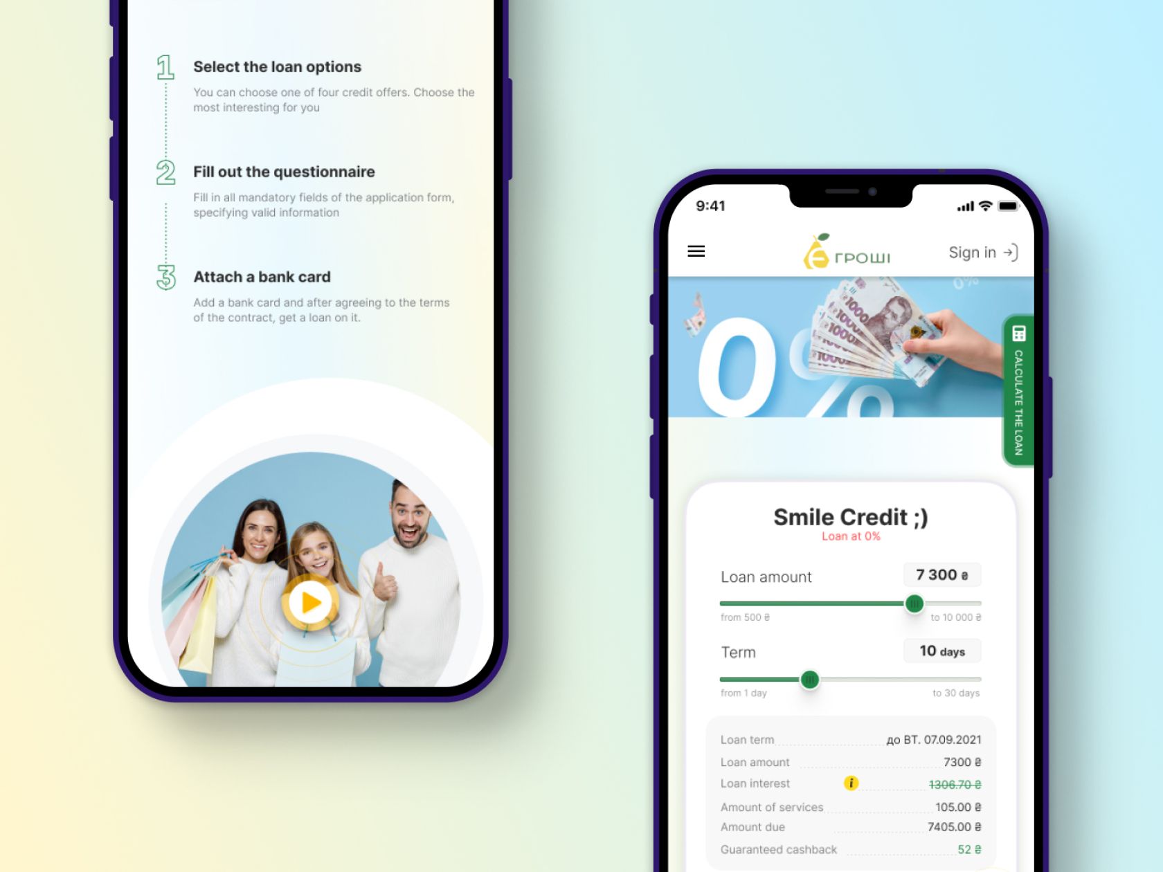
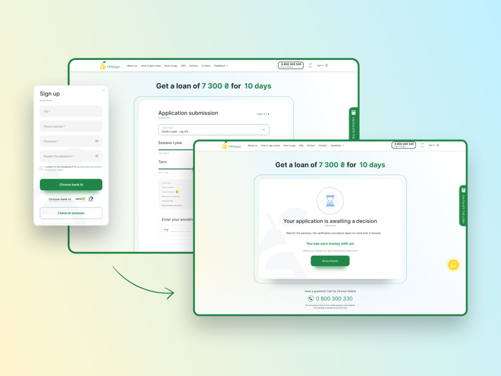
1.Structure development. We had to take into account the essential nuances of working with the site for microcredit. For example, on the first screen of the site, there should be a calculator that would calculate the interest rate when choosing the loan amount according to E-Groshi.
2.The design of the PC version of the site. The second phase was to design and create a unique site for the page. This phase includes the design process to achieve the most acceptable result for the client.
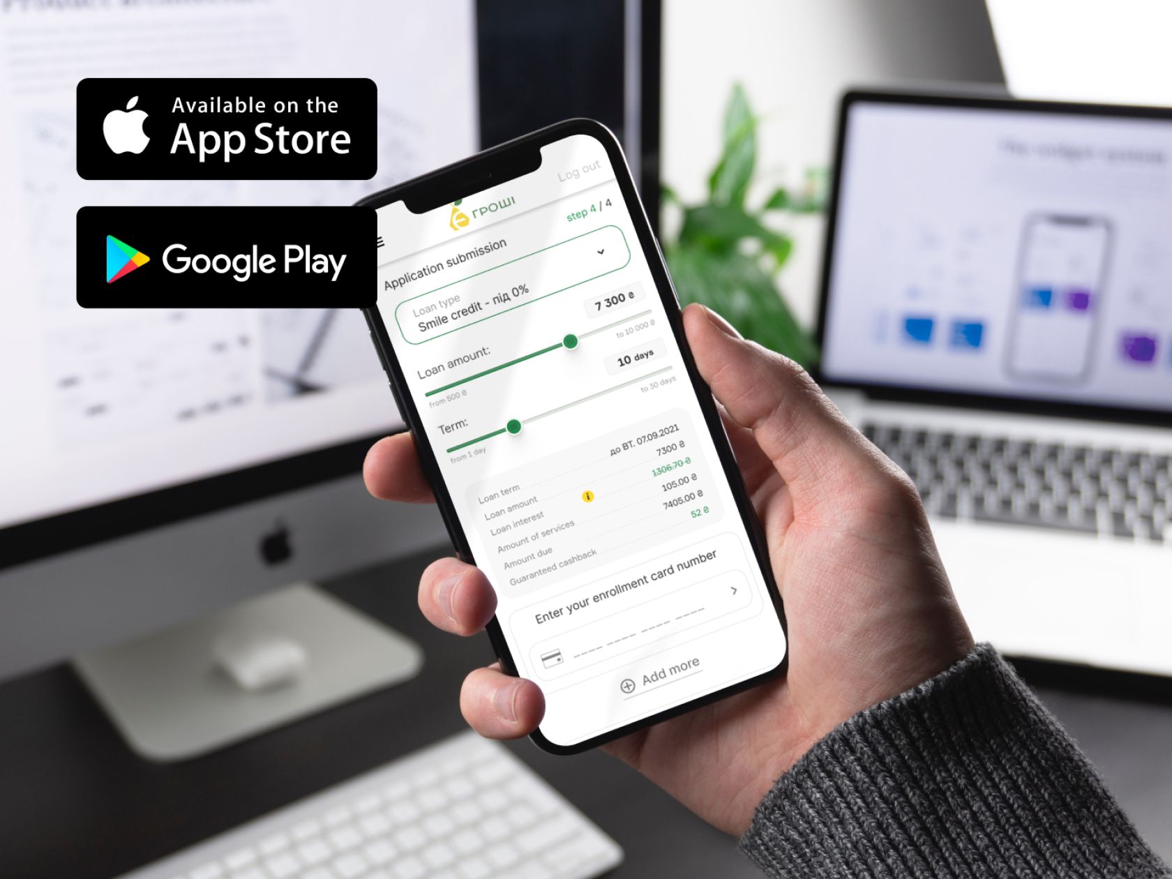
3.Design of the mobile version. As the majority of users open the site via we paid especial attention to the mobile version.
Looking ahead – the new website design was created exactly on time. At the same time, our team encountered a few problems that were not an issue in getting the job done.
Main challenges
Almost immediately after the start of the work our team faced major challenges. We try to look for an individual approach to each client, so we immediately paid attention to the main requirements of the client in the development of the site:
New Logo
Another important wish of the client was to design a new logo for the company. After several options, the client decided to keep his current logo and implement it on the new site. Our team created and delivered three versions of the logo. The client was hesitant about whether to change the logo and ended up keeping the current one. The logos from our team can be used in the future.
Use of Brand’s Color
A critical requirement from the client was to keep the color palette from the old site. The entirely new design had to be with the use of brand colors. Such a request did not limit our team but simply set certain requirements.
New Calculator Design
The second influential requirement from the client is to recreate a new calculator on the site. Such calculators are a must-have on the pages. So our task was to update the current calculator and make it more convenient, and updated, and not to forget about using brand colors.
Results: New Fresh Site
As a result, our team managed to create a unique design in the agreed timeframe of 1.5 months. We also create an individual tone of voice for E-Groshi, which is still used. Our team created a UI/UX design that was completely user-friendly for the clients of the service and was also using specific company colors. We also created a high-quality mobile version of the site. In a month and a half and in three stages, we created an updated product, which had a positive effect on the E-Groshi service.
You need to update your site as often as your clients' needs change. Therefore, if you also provide services in the financial section, we advise you to contact WEZOM experts for a first consultation about how to update the old site on WordPress.