These days, despite its relevance, the niche of dating apps has not faced anything innovative for a long time. Over the past decade, the user experience in products like Tinder has remained unchanged: it’s still the same swipes, profiles with photos, chats, etc. Our client decided to bring fresh breath into this niche by proposing a non-trivial idea to create a dating app and, thus, entrusted it to us. We implemented this idea and now are ready to talk about this experience. So, how did we create a new-generation dating app?
Who Was the Client?
Our client’s business is IT startups: the client’s team performs the full cycle of digital product development, promotion, and support. As for the idea of a dating app, the client understood that bringing it to life is a complex and extensive task, requiring specialists with extensive experience in this niche. Actually, this was the main reason for turning to WEZOM.

The fact is that the vast majority of dating apps face a gender imbalance – according to the marketing provider Ogury, there are about nine men for every woman on Tinder. Moreover, even in the female-friendly app Bumble, 80% of users are men. This age-old problem harms the audience and breaks the idea of online dating. In turn, through the launch of a new dating app, the client wanted to overcome it.
The second challenge was to provide a specific context for in-app communication, tying it to the interests and hobbies of the audience. Indeed, despite having some experience in online dating, many users still do not know how to start communicating with people with whom they had a match. That’s why the client decided to add a certain context to this process within the application, connecting it with a current topic – astrology. After all, no matter how skeptical you are, when viewing the profiles of potential partners, you still often pay attention to their zodiac signs.
What Were the Tasks and Goals?
Since the client approached us with nothing but an idea to make a dating app, we had to implement a full development cycle, which began with the discovery phase. This phase covered project management, business analysis, and design tasks. Together with the client, we came up with the technical task for implementing the app. Designers processed the UX mockups and approved them.
Overall, the project's main goal was to develop a modern dating mobile application from scratch, available on iOS and Android platforms. To achieve it, our team had to complete the following tasks:
- creating a recognizable, branded, and attractive UX design based on familiar mechanics (matches, swipes) but with the addition of unique gamification elements;
- development of cross-platform mobile software for iOS and Android platforms;
- development of a web admin panel to manage the application;
- development of a web landing for project promotion.
As you can see, the project turned out to be complex and required a large team. Specifically, to make a Tinder like app, we engaged a Project Manager, a UX Designer, a Frontend Developer, a Backend Developer, a Mobile Developer, and a QA Engineer.

What Were the Technologies Used in the Development?
To bring the application to life, our team used today's best solution for cross-platform mobile development – the Flutter framework, based on the Dart language. Our developers implemented many projects on it. It is also worth noting that it is supported by Google and simplifies the creation of unique visuals with smooth animations.
We chose the NestJS framework, the PostgreSQL database management system, and the Socket.io JS library for a microservice for the app's online chat.
As for the backend implementation, we settled on the Laravel PHP framework and the GraphQL syntax. These technologies ensured the app's high performance, stability, security, and ease of further support and scaling.
Finally, to create a web admin panel for app management, we chose React JS, a library that significantly speeds up the development process thanks to hundreds of ready-made components.

How We Built Workflows and Reporting
When we started to create a dating app from scratch, we decided to adhere to the iterative Scrum framework based on short sprints. In particular, development was carried out in two-week sprints and involved regular demonstrations of results to the client. Also, our team constantly analyzed its effectiveness – that’s why each sprint included planning, grooming (backlog clarification), and retrospectives.
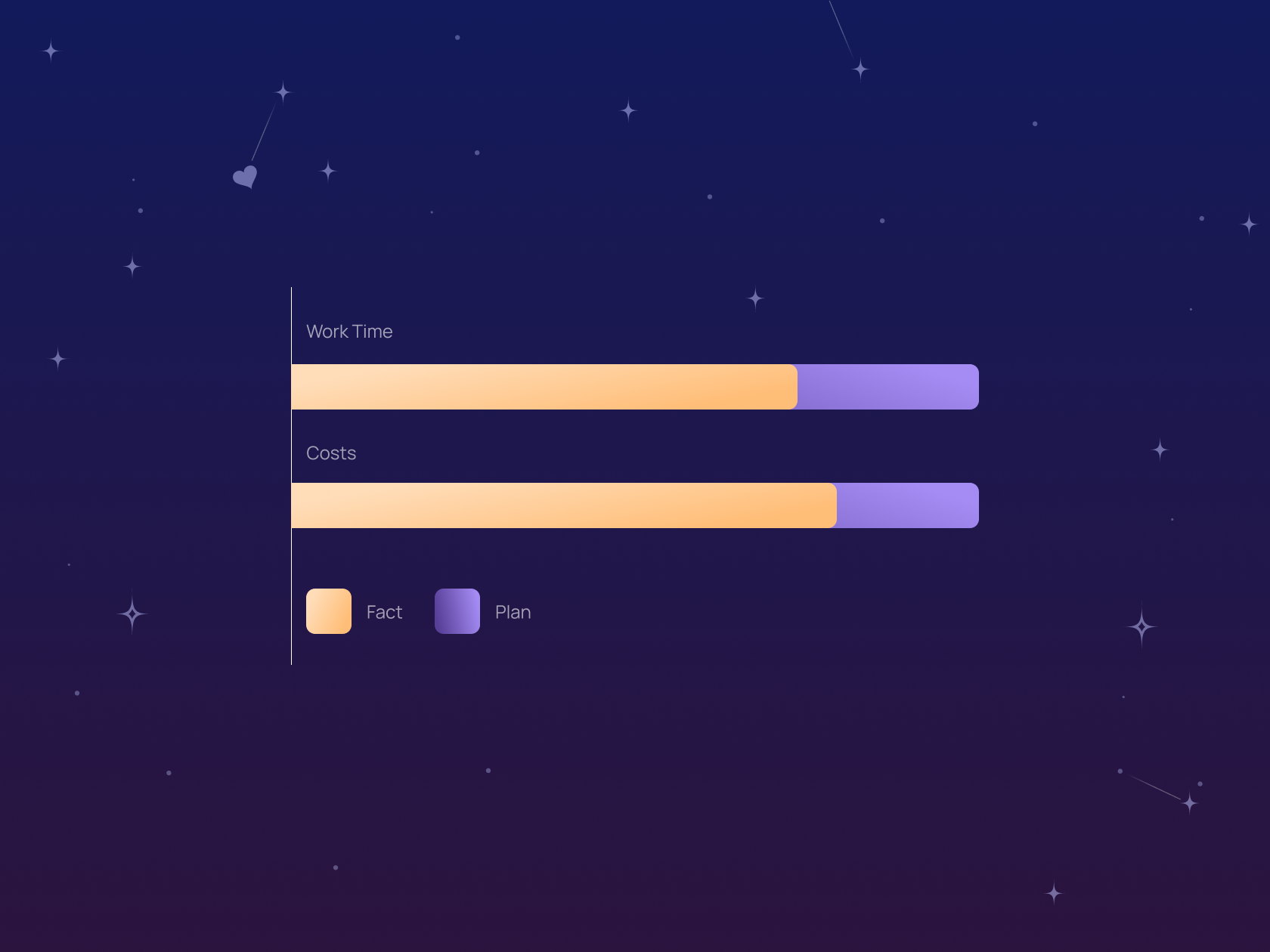
In our practice, all sprints within a project have to be carefully documented. Clients receive reports that include financial costs, hours worked, and work performed. However, we offered the client new financial reporting standards in this project. The Project Manager prepared a document that visualized the costs for each sprint. In addition to the numbers, the file contained a budget burndown chart for each sprint.
In addition, the new reporting form contained accurate estimates of work completed in sprints. For example, the backend team spent a total of 670 hours but completed 910 hours of scheduled work.

In a separate table, the client can check the difference in hours and, accordingly, in expenses. These reporting practices provided a comprehensive view of how the development process aligned with the budget. Due to the effectiveness of this approach, we consider the possibility of its implementation in all subsequent projects.
What Our Developers Are Proud of
It’s impossible to imagine a modern dating app without a fast and convenient chat. However, existing package solutions for integrating chat functionality did not meet the requirements of the project: they did not allow for a unique design, did not ensure data security, and also had limited customization options. In addition, as the number of users grows, the use of external paid modules could become unreasonably expensive for the client since their monetization is often connected with traffic size.

That's why our team created a new microservice from scratch for in-app online chat. It was a completely custom solution enabled to scale and meet absolutely all the client’s business requirements. This microservice could be adapted to the changing business needs and also allowed us to take all the necessary measures to protect personal user data and the security of correspondence.
Before we started to build a dating app, our team did not have significant experience in developing custom mobile chats. Therefore, we decided to develop a unique architecture for similar tasks we may face in the future.

Although the created solution cannot compete with full-fledged instant messengers, it can still be helpful for any business that needs communication between people: online services, e-commerce, internal corporate communications, etc. You can find all the details of this development on this link – here, we talked in detail about the technologies and stages of creating a microservice in our blog.
What We Ended Up
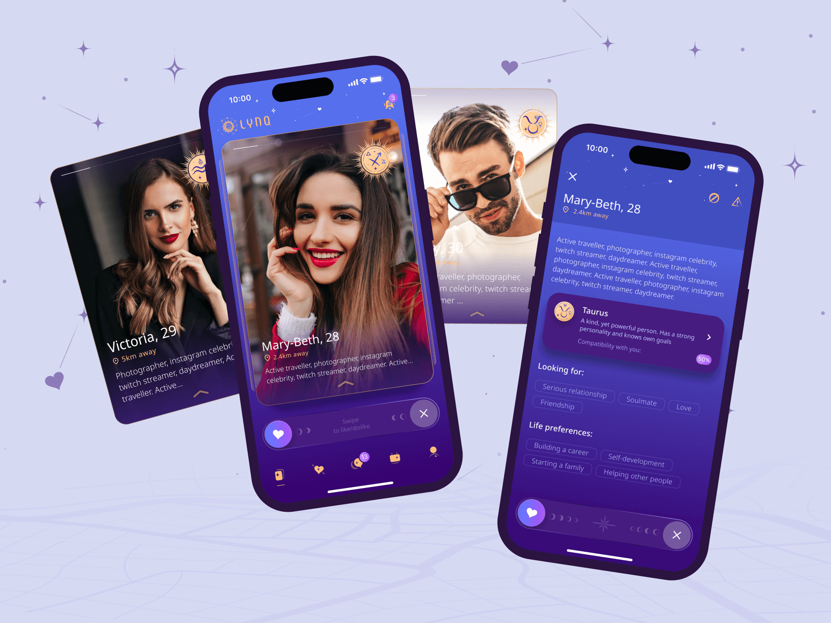
Our work resulted in a sensational dating mobile application, which differs from well-known analogs in its unique astrological design and several unusual functions. So, what makes LYNQ different from the competition? Let's analyze its main features:
- Dating calendar. In this module, users can select any date and get help from the stars. Also, they can get a hint of whether a particular day will be good for meetings and new acquaintances and check recommendations and ideas for a planned date;
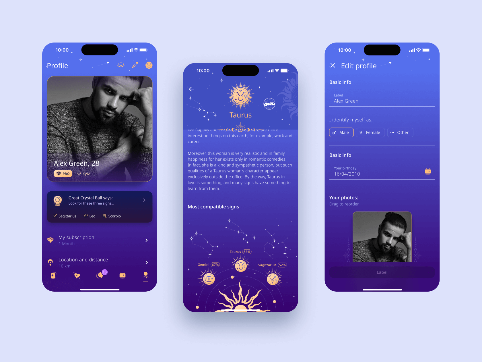
- Crystal ball. The Great Crystal Ball algorithm is available for Pro users. This game mechanic generates small predictions and tips on dating and zodiac compatibility;
- Zodiac signs. On the app's main page, users can view photos of potential partners and their zodiac signs. User profiles also contain descriptions of their zodiac signs – in work, friendship, relationships, etc.;
- Compatibility check. An infographic of compatibility by zodiac sign is available in the user profile. In the Pro version, the user can get a detailed description of the zodiac pair of interest (for example, Taurus + Gemini);
- Zodiac filter. This is one of the most important features of the application: users can filter the output of profiles by zodiac sign. That is, the search can be configured so that users see a list of Leos only or Scorpios only.
In general, all these gamification elements make the familiar online dating experience more exciting and add a bit of mysticism to it. At the same time, the user does not feel confused as we still adhered to the generally accepted mechanics – swipes and matches.
Results of Our Project
Over seven months of work, our team implemented a unique dating application with a custom online chat and web admin panel. The project was successfully launched on the Android and iOS platforms, after which it received approval and loyalty from users.

For WEZOM, the task to design a dating app, LYNQ, was a turning point, as it allowed us to introduce several important changes to our internal workflows. We provided our partner with a top-quality product, implemented important architectural approaches for the future, and introduced transparent financial reporting.
This is not the end of the dating app development life cycle. We are already working on UX improvements and expanding the application's functionality. These changes will allow LYNQ to gain a foothold in the market after its successful start. Undoubtedly, this startup can eventually become a strong competitor to monopolists like Tinder.
If you are also inspired by an idea and are looking for an experienced team to implement it digitally, feel free to contact us. We will apply our best practices and knowledge to make your product stand out from the strongest players in your niche.
