Together with its visual appeal and demonstration of brand identity, user interface designs for e-Commerce solutions are aimed at making the shopping experience comfortable, intuitive, and productive. For those who create them, the task sounds quite difficult, doesn’t it? However, nothing is impossible for those who strive to gain new knowledge. Actually, we are going to share this knowledge in this article.
The Importance of Smooth and Seamless E-Commerce Website Navigation
Navigation determines how visitors will move around a website, how quickly they will be able to perform a target action (be it making a purchase, subscribing to news and promotions, registering an account, or something else), and, overall, how satisfied they will be with the experience they received. All navigational elements should be well-thought-out to minimize the rate of leaving a website before completing a specific task.
Let's find out how you can achieve flawless navigation in eCommerce solutions.
Correct distribution of products by categories
At the top of the page, you need to place a list of existing product categories so that visitors to your website can quickly navigate how to narrow their search. There can be many categories – this is a normal situation, it is only needed to present them correctly – for example, in the form of a drop-down menu.
In turn, if the number of categories is up to ten, they can be presented in the form of buttons or checkboxes that are located sequentially one after another.
Search optimization
The search bar should be accessible from any part of the website, as well as be easy and intuitive to use. You also need to ensure that your search engine supports all types of user queries, from product names to their attributes.
And, of course, don’t forget to implement an autocomplete option so that after users enter 3 or more characters, they get possible product options for the product they are looking for.
Various filters
Since too many options make searching difficult and often leads to visitors leaving your website without buying, you have to implement a well-thought-out filtering system that will speed up the process of finding the products the users are really looking for. This can range from basic sorting options (bestsellers, price from low to high, etc.) to more advanced filters with checkboxes or radio buttons.
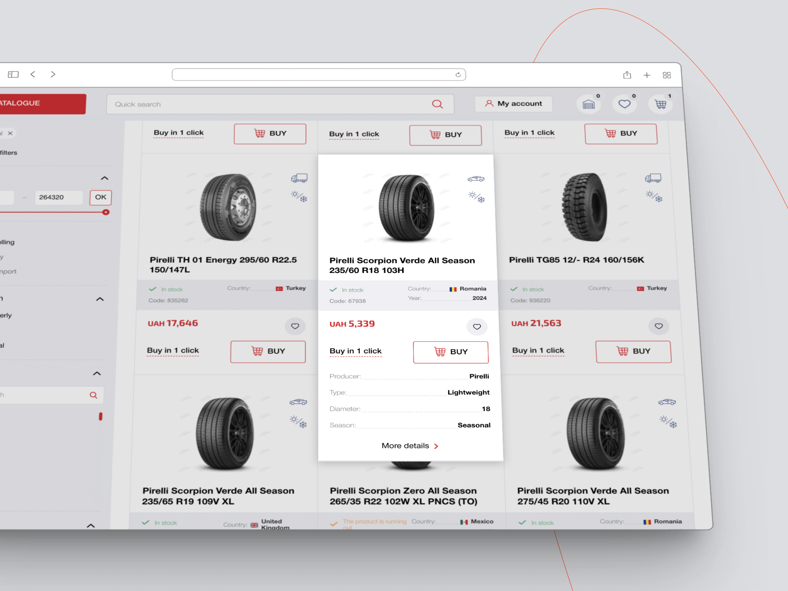
Ability to quickly view products
Users should be able to quickly view products without visiting their pages. This is usually done through a pop-up window that appears when hovering over a specific product. Make sure that in this window, users can see the basic characteristics of the product, as well as its form factors available for purchase.
Launching promotions and special offers
And, of course, give your customers the opportunity to buy products on special offers – for this, they should be as visible as possible in all parts of the website (for example, in the form of offers "product of the day", "last 5 units left", "2 hours left until the end of the promotion", and so on).
Product Page Design
Product pages should be informative but, at the same time, not look overloaded with different types of content. Let's find out how to implement these ideas for the website UI in practice.
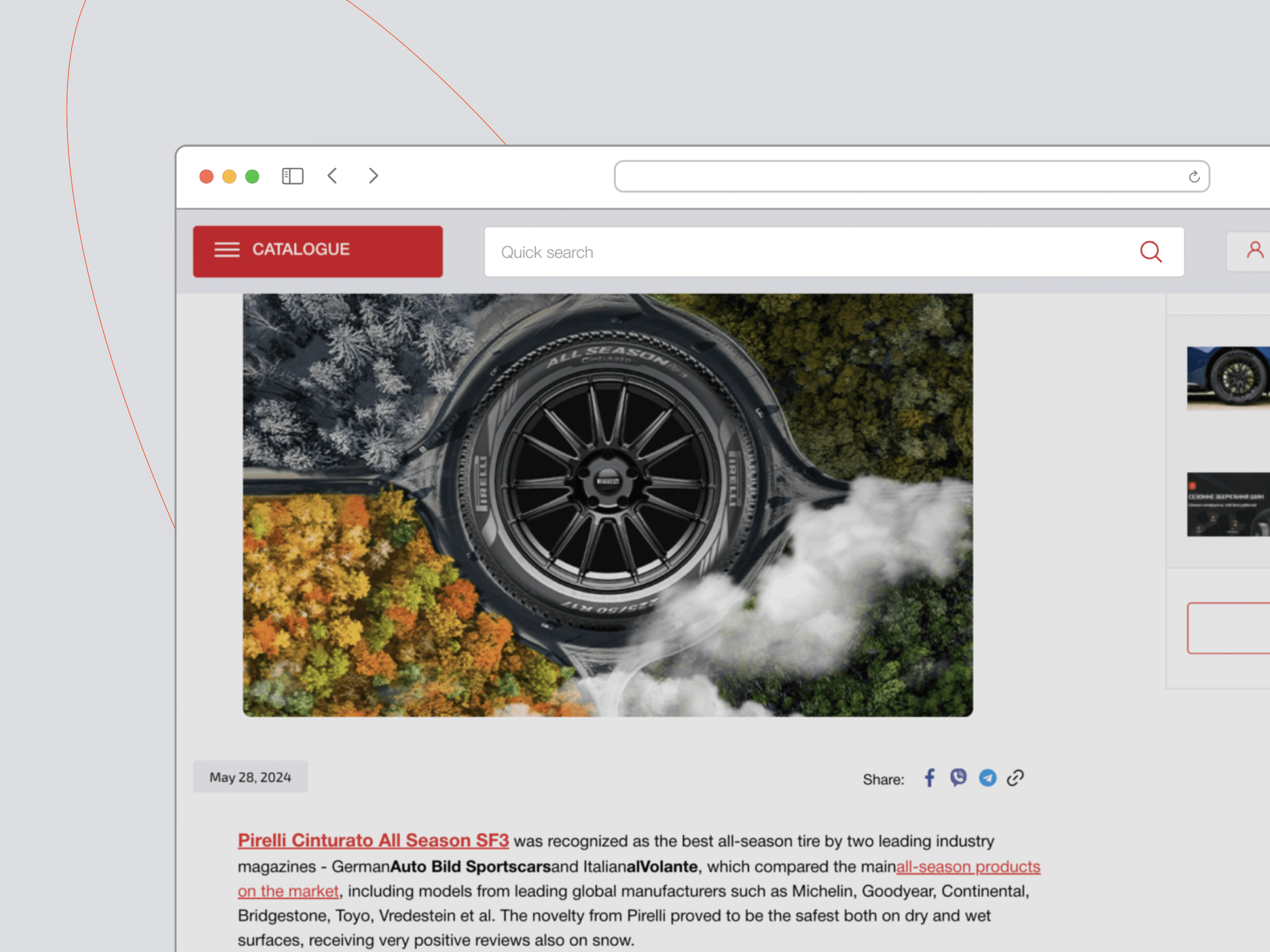
Prepare pictures and other media for high-quality product visualization
Since e-Commerce solutions do not yet allow customers to “get to know” products in person, you must provide them with a worthy alternative for checking the characteristics they are interested in through high-quality images and videos.
In particular, they should have a high resolution and a neutral background (preferably white, black, or gray), clearly demonstrate the product from all sides (by the way, 360-degree videos are great for this), and also be unique and scalable.
Be consistent in your actions
Make sure that all product design files on your website have the same style and also correspond to the overall style of your online store. Otherwise, your online store will look unprofessional and will hardly be able to gain the trust of users.
Shopping Cart Design
Since the shopping cart is where users finally make sure they have made the right choice and place an order, you should follow these recommendations to make these processes as convenient as possible for them:
|
Tip |
In Detail |
|
Think carefully about your CTAs |
In the context of shopping cart page design, a call to action can be considered to encourage the user to place an order. It is usually placed on buttons of bright colors, in a separate area. It is also worth paying attention to the conciseness and mutual unambiguity of the message of your CTA. |
|
Don’t forget about immediate feedback |
Don’t forget to equip your CTA button with an immediate response to the user’s click – this way, your website visitors will understand that they are getting closer to completing their order. In particular, you can show buyers a text like: “Your order is successfully placed” and also demonstrate a relevant animation (optionally with sound). |
|
Use the shopping cart widget |
Give your customers the ability to add new items to their cart without leaving the page they are on – this can be done through shopping cart widgets, i.e. mini versions of the shopping cart that are visible from anywhere on the website. |
|
Clarify product details |
Make sure that key product attributes are also displayed after adding them to the cart. This will help your users make more informed decisions about their purchases (as they will be able to edit their shopping list right there), which will ultimately reduce the percentage of returned products. |
|
Ensure cost transparency |
Avoid having your customers hit with costs they didn't expect – whether it's due to dynamic shipping pricing, taxes, or anything else. For this, you can provide them with all the information they need before they place their order. |
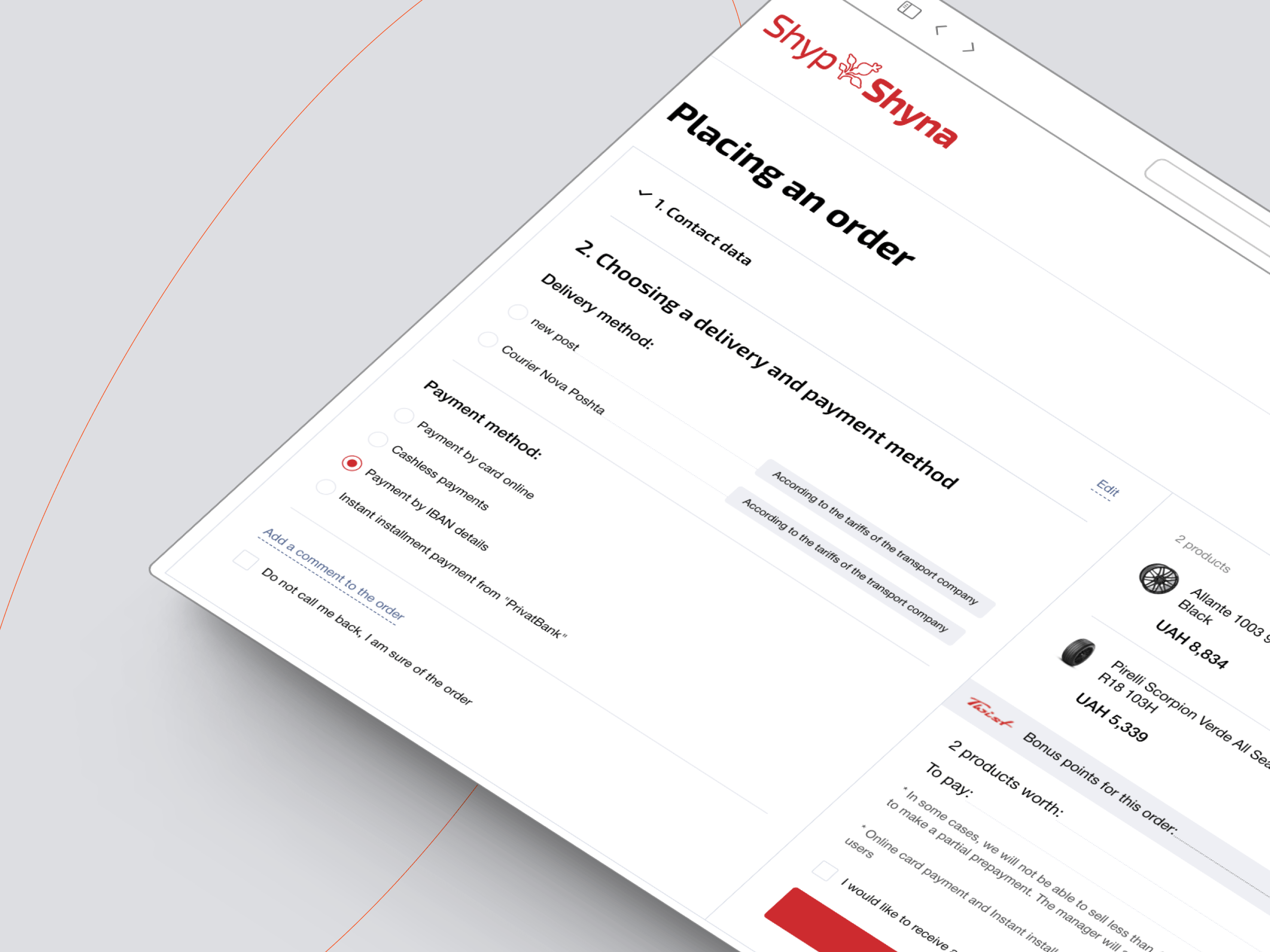
Checkout Design
Finally, a few words about the web design of another type of page that leads users to the final stages of the sales funnel.
Implement several payment options
If you want to reach as many people as possible, you will need to make sure that each of them has the best possible user experience – this can be done, in particular, by integrating your website with multiple payment systems. Ultimately, the more options you offer, the better the user experience will be.
Speed up the checkout procedure
Try not to clutter the eCommerce UI with numerous fields to fill in – this will make the checkout process tedious and increase the percentage of abandoned carts. On the contrary, if there is only one checkout page that does not require the user to scroll down, this will significantly speed up the process of placing orders.
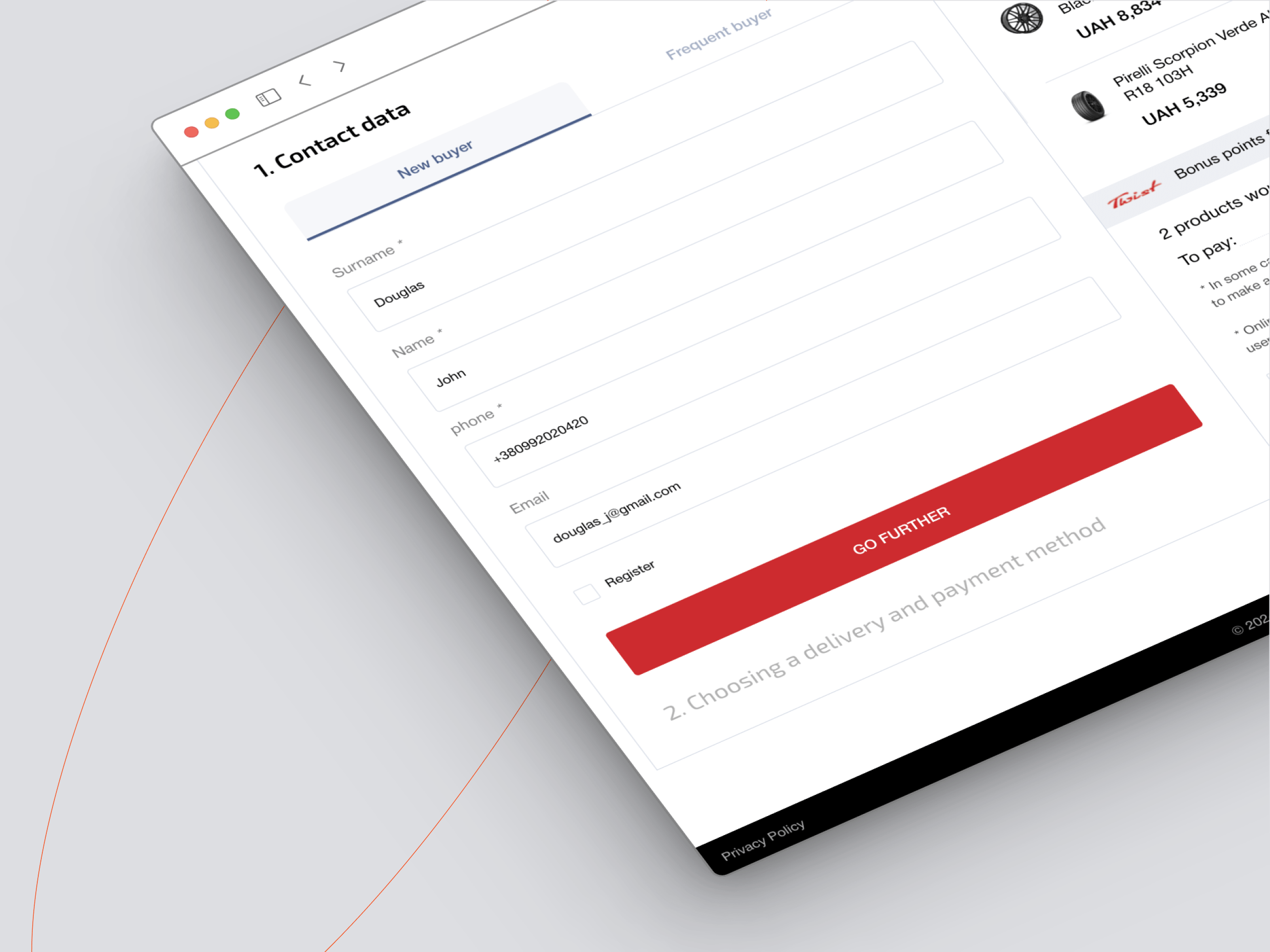
Create the necessary checkout functionality for both registered and unregistered users
You should not force your visitors to register on your website in order to make a purchase. If you want to get them to register, come up with other methods and approaches for this – in turn, the option to place an order should remain available for both registered and unregistered users.
Use progress bars
If you do have to implement a multi-page checkout process, give your users the ability to track their path to placing an order in real time. This is where progress bars will come to your aid, showing how many steps have already been completed and how many steps are still ahead.
Prevent potential user input errors + live chat with support
If a user does something wrong during the checkout process, he or she should receive immediate feedback about it so that they don’t have to go through the process all over again. Pop-up notifications with clear and understandable messages about detected errors will help you achieve this.
Don't forget to prominently display your customer support contacts so that your customers can clear up any doubts along the way to placing their orders.

Let's Talk about E-Commerce Design Using Our Case Example
In this paragraph, we offer you to analyze the best practices of implementing eCommerce design using the example of a project we have completed. Also, for the sake of the objectivity of our review, we will point out the shortcomings that we have already realized and are currently engaged in their optimization.
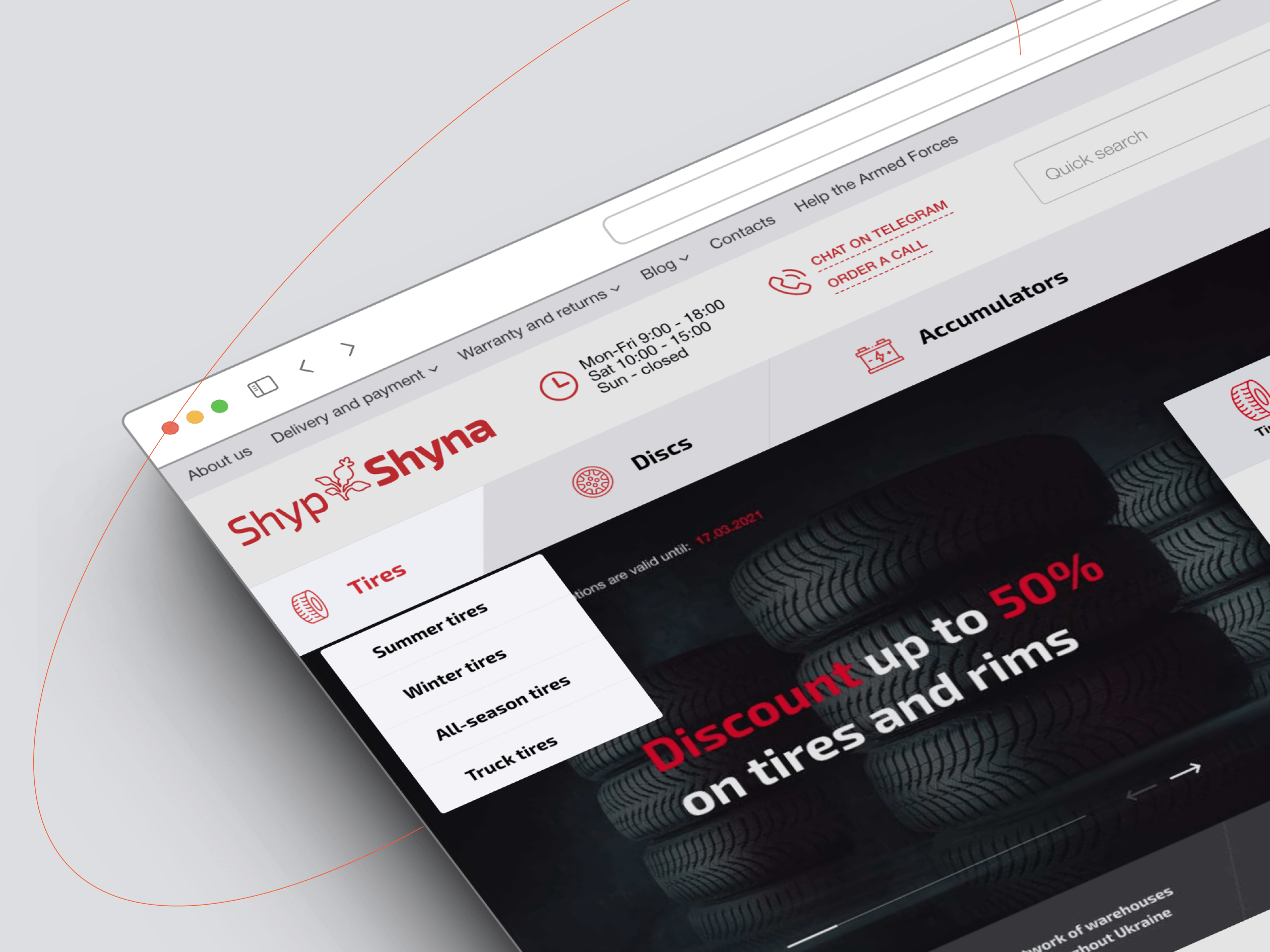
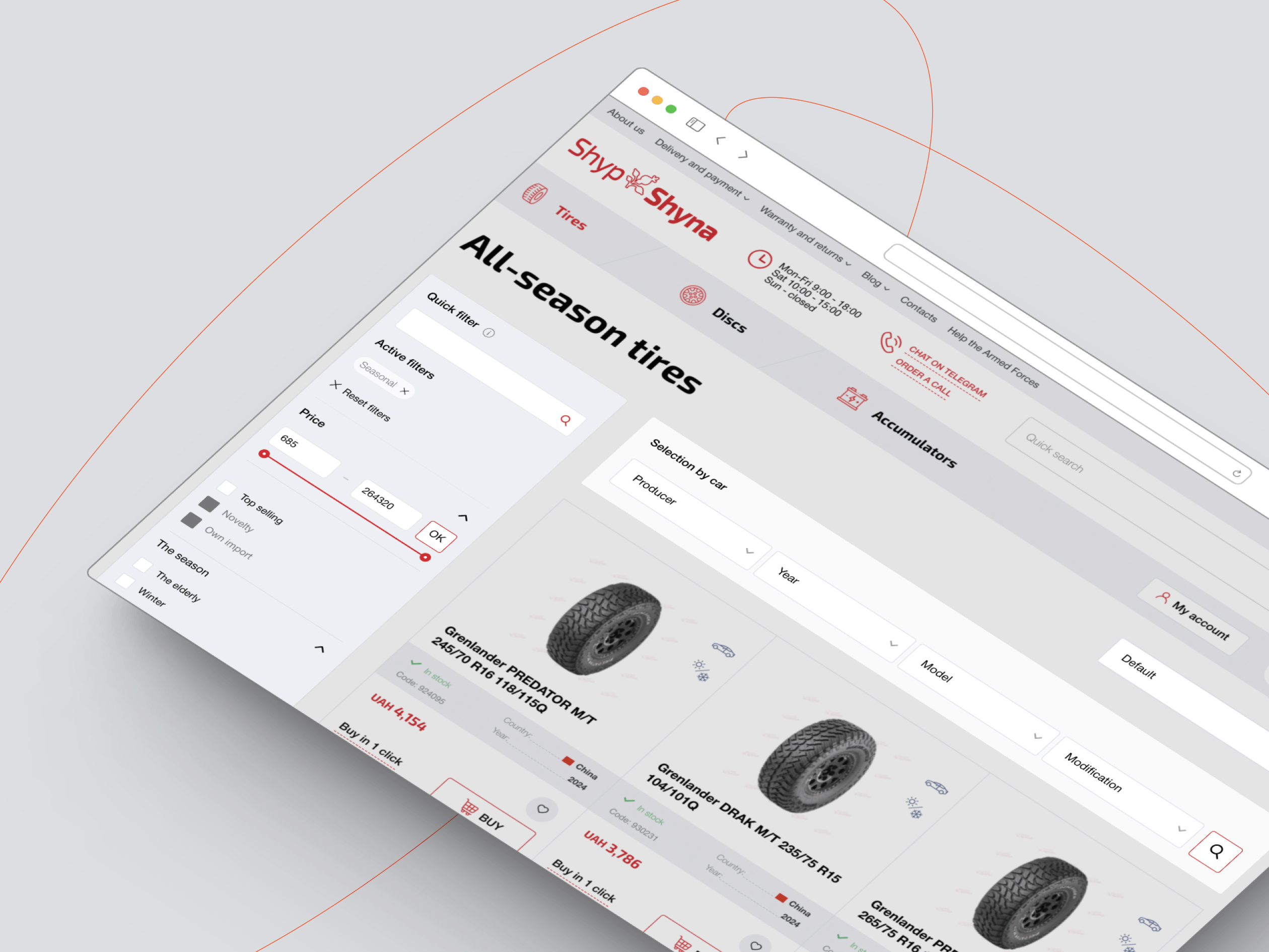
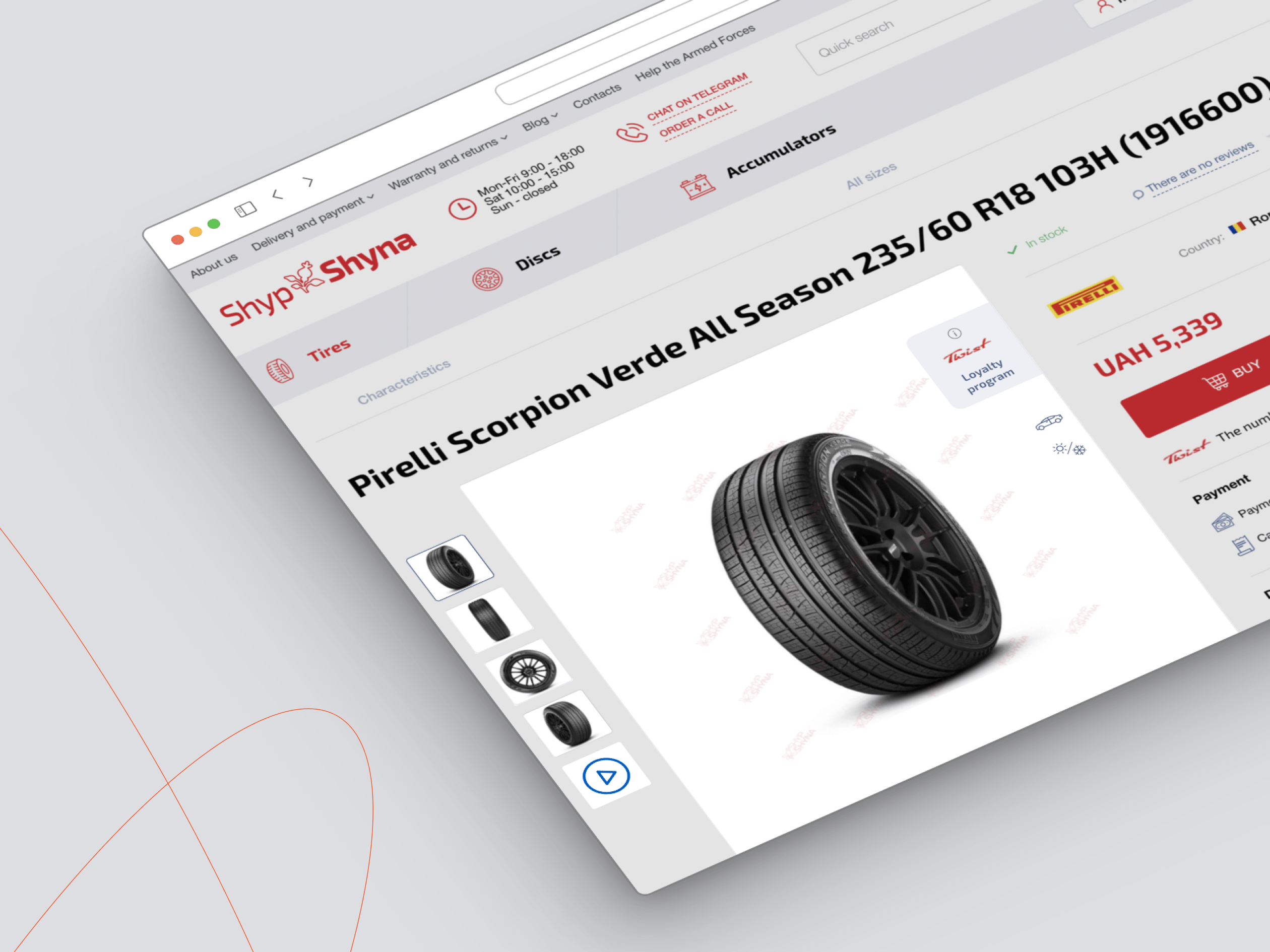
In particular, not long ago, we were contacted by the owners of the well-known Ukrainian tire retailer Shyp-Shyna, which has existed in the local market since 1993. As the client was not satisfied with the previous version of the online store, we were tasked with building a new, more flexible, and modern online shopping platform, capable of withstanding large flows of visitors and providing a higher-quality eCommerce user experience.

After we completed this task, our team conducted a series of focus group surveys, after which we received the following feedback:
- The design is clean and modern
- The website has a well-thought-out layout and overall looks attractive and easy to use
- CTAs are immediately visible, they do not have to be “discovered” during interaction with the website
- The navigation bar, due to its placement at the top of the website, is easy to access, and the categories in it are clear and convenient for speeding up the search procedure
- The website has additional filters for searching, which also significantly speeds up the product selection process
- The website perfectly “adapts” to different screen sizes, which is fundamental for mobile users
- The website has a visual hierarchy, great accents, and everything is adapted to present the products in an informative way
- The website contains all the information necessary for buyers to quickly contact the customer service
- This eCommerce website UI design can be presented in two color themes: dark and light
At the same time, the following shortcomings were noted:
- The header seems overloaded (there are too many elements: company logo, contact information, business hours, search bar, and user account details), which may distract some visitors from the main navigation
- In some places, the font of this eCommerce user interface looks too small (particularly in the headings and submenus)
- The color palette seems a bit limited, and the contrast is insufficient
- There are no settings for changing the language on the website (although there is no need for this yet since the website is implemented for a national retailer)
However, it is important to note that all of these recommendations are not the only viable option for ensuring customer loyalty as each edit to please the opinion of the focus group must be justified both in terms of costs and maintaining the logic and consistency of user flows. Therefore, before accepting any opinion, it is essential to agree on its feasibility with your development team.
Extra Tips and More
Finally, here are some more non-obvious tips that our eCommerce UX/UI designers shared with us.
| Tip | In Detail |
| Anticipate customer expectations | According to statistics, customers expect about 77% of standard user interface elements to behave in a certain way. This means that creativity only makes sense where it is truly appropriate – otherwise, all your actions will be counterproductive to the quality of the user experience. |
| Keep mobile users in mind | As the e-Commerce experience increasingly happens on mobile devices, it is crucial to ensure that your solution works and looks equally good on all the platforms it supports. |
| Don't overload the interface | While users still value informative product descriptions, you should not overload product pages with text blocks. Thus, you should allow your online store visitors to expand the information they are interested in (for example, via drop-down menu buttons) if they really need it. |
| Implement wish lists and recommendations | While almost every modern online store has this functionality, not every one of them cares about the fact that saved products do not disappear from there over time. Thus, you will need to think about how to eliminate this problem for products that have not disappeared from your store forever. |
| Make your solution accessible | Don't forget to ensure the inclusiveness of your online solution for different categories of visitors, allowing them to connect a screen magnifier, use voice input, change contrast, etc. You can read more about web accessibility guidelines here. |
| Avoid copypaste | No matter how attractive and successful ready-made solutions may seem to you, you should not copy-paste them. As practice shows, copies always find it more difficult to retain their audience, so you risk deliberately lowering your chances of success. |
Entrust your project to seasoned professionals
Even if you are an experienced business owner, it makes sense to listen to the opinions of experts who have worked on hundreds of projects similar to yours. In particular, you can turn to us as a team that has specialized in developing eCommerce solutions of various scales and complexity for many years.
From project to project, we apply our best practices in business needs analysis, market research, and technological experience. The result of this formula is projects that provide their owners with a strong competitive advantage and stable digital presence already in the first weeks after entering the market.
