
About the Client
Delivery Group is one of the largest B2B freight consolidators and oversized load transporters that came into existence 20 years ago. B2B is the main arm for which the company provides its services. Delivery has around 430 offices and warehouses nationwide. On average, the company provides services to more than 500,000 clients and completes more than 1000 delivery departures.
Understanding the Client’s Challenges
When Delivery Group came to us, the internal team already had digital widgets and mobile applications developed and maintained. The old app had many limitations: it needed a lot of improvements, plus there was a lot of feedback from the users as to what additional functionalities they wanted to implement into the app. For example, the application had no option to change addresses once the order was placed. Users were also not able to track the deliveries. They had to come to the office in person to make changes to the order they placed. Users could not change their email or payment methods. It negatively affected the customer service because the users were used to having these features in other applications.
The Delivery’s stakeholders decided to outsource the development and future support. The requirements were as follows:
- A modern and captivating design.
- Implement a variety of features for users to be satisfied with. The end product should have all the necessary functions and information to minimize the number of times users reach out to customer support for help.
The client wanted to see some of the approaches IT companies have regarding what they can offer. Delivery Group placed a contract opportunity for IT companies to bid on, using an automated RFP process to streamline vendor selection and improve transparency. The participants were given the same requirements - offer a way to modernize the old application, including the options to track loads, order pick-up and Delivery features, invoice generation and management, and CPQ calculator for instant pricing feature.
On our end, we created a conceptual effect that consisted of 6-7 interactive screens instead of 2-3 that were required in the RFP. Our team always digitally visualizes clients’ requests before we begin the work. We are interested in the search for the best possible solution given the ability and resources of our company.
/_1%20(1).png)
Our business analysts dived deep into the market and client’s competitors. From there, we were able to identify and visualize what trends there are, and the market needs. In the end, we were given the highest score compared to the other contract bidders. When we were selected, the Delivery Group manager said that we were the only company with a client-oriented approach.
Solution
During the initial rounds of communication, we clearly understood that Delivery’s customers had already established certain habits and attitudes toward the brand, products, and services. We needed to keep these habits for the new app while adding some additional features to improve the overall experience. To make the app convenient and engaging, we implemented a spectrum of features.
One of the key requests from the client was to make the app cross-platform, which was the best choice in regards to cost-effectiveness and convenience of further maintenance. That is why we chose Flutter development as our foundation. Besides the fact that the framework is adaptive to both iOS and Android, it also keeps the interface consistent across the platforms, has excellent performance and has an elegant code structure that is easy to work with.

The structure of the application was developed in the following manner: The screen was divided into three components - general, commercial, and informational screens.
General Screen
The general screen consisted of features and information regarding orders, invoice generation, notifications and search panels, maps, and documentation.
Commercial Screen
The commercial component consisted of news and promotions. All information regarding the sales, promotions, updates and changes were added to this section.
Informational Screen
The informational component included the plans data, services, loyalty programs, online support, as well as other information.
Enterprise Mobile App For Delivery Group - Cross-Platform Solution for Automated Delivery
The client needed the app by the end of the year, so the development was strategically organized into 4 months of work using Scrum methodology. Considering the tight deadlines, the development was divided into the following segments:
- Prototyping
- UX/UI design
- Front-end & back-end development
During the design and structure development, our goal was to keep it intuitive for the end-user. For example, we moved the invoice creation button, which was previously hidden inside the CPQ calculator, onto the main screen. We also united and labeled all the elements in the notification section for users to avoid getting lost in the messages. We designed and implemented branded icons for the app to be intuitive and user-friendly.
Initially, the client wanted to have two different interfaces for registered and unregistered customers because many of the Delivery Group’s customers had already created and used the accounts in the past. Therefore, we personalized part of the app - on the side of the main screen, we placed the plan’s information with rates. For the unregistered users, the upper side of the screen consists of the action button “Register.”
Delivery Group’s target audience is entrepreneurs and businessmen/businesswomen that are actively using Delivery Group. On average, the company makes around 1500 trips, delivering loads to the customers. Besides tracking the Delivery status, the customers also wanted to have analytics on the past orders. Thus, for the customers’ convenience, we divided invoice organization into two parts: sorting and filtering segments. We also added the ability to group operations for more precise tracking.
We decided to remove the previous banner-slider from Sales & Promotions, which was navigating transitions between the pages. Since we already had the icons for the sections on the main page, it was redundant. Customers use the app for work, so any repetitive elements would only confuse and irritate the user. Moreover, the section already consists of the search, which is another way to access the data necessary.
Instead of the banner-slider, we added visual previews of the elements inside each of the Sales & Promotions listings. In the future, once the company starts using Big Data and begins to nurture user data on a larger scale, it can use the analytics data from this section to make strategic decisions.
Logout element was built-in with two options: a user can log out and keep the login information to reauthorize without retyping the data or log out with cache deletion, which erases all the previous login data.
In other words, since the app was built with B2B users in mind, the logic was to make every action according to the users’ initiatives.
Project Challenges
One of the most challenging tasks we had to face during the development was associated with the CPQ calculator. This calculator outputs the price based on the services added to the order. It uses geographical data, services, and delivery types as the inputs. If the user is authorized, the search gets auto-filled according to the previous searches. The same is also true for the order history and delivery types: addresses that were used in the past would be auto-filled once the app recognized the initial symbols; however, the user can change them if necessary. The estimated shipping date and date of arrival are calculated automatically as well.
The challenge was that Delivery Group provides various services and products: freight, pallets, parcels, documents, and niche-specific plans. Each type of freight in the CPQ calculator requires specific fields, and the delivery cost is calculated using individual formulas. It means that for each element, there is a unique screen, calculations, and requests.
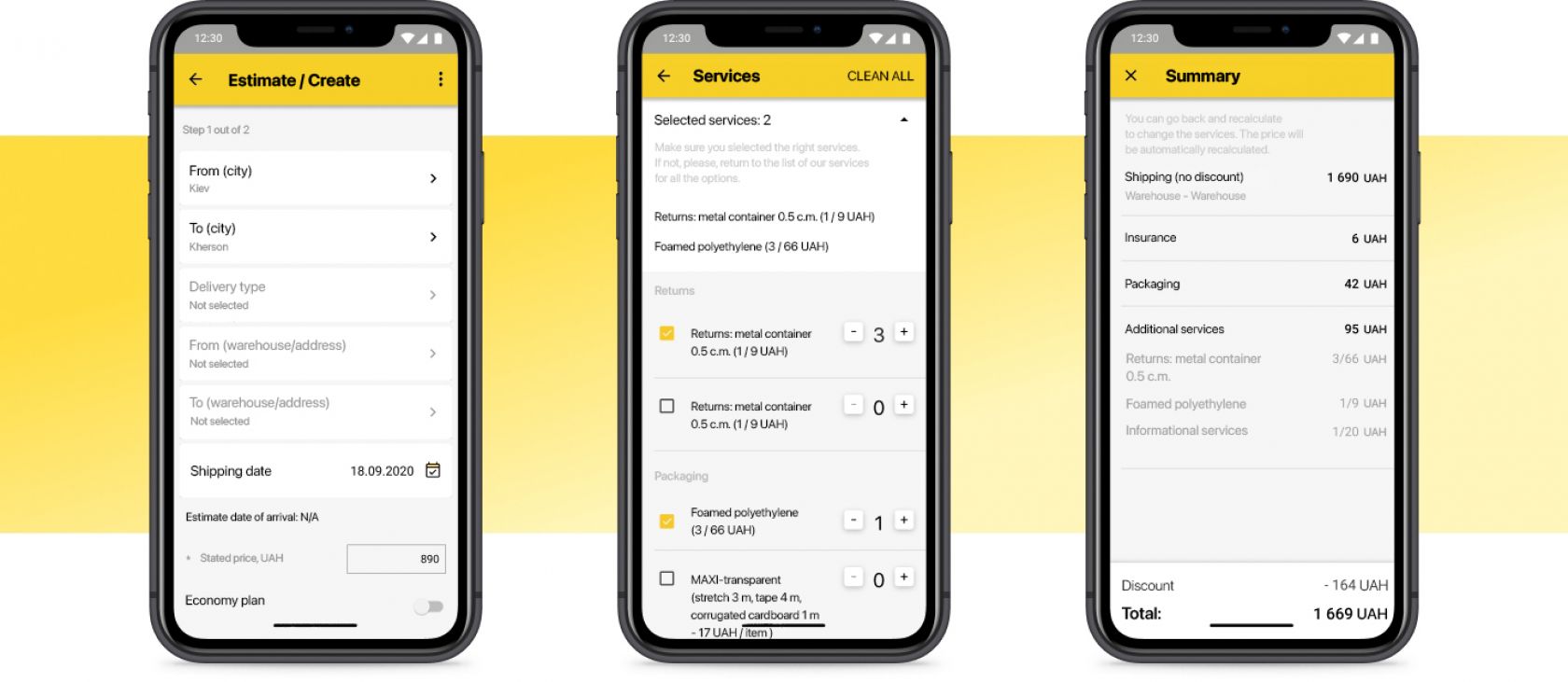
There are also many additional features. Let’s say a user chose “Freight” as a service type. The next step would be to input the quantity, weights, and volumes. If the volume is calculated, the user can input it; if not - the user must indicate the parameters for the freight so that the app can automatically calculate the volume. The user is also given the opportunity to choose insurance. After that, the user is provided with other options: continue with the order, save the order as a template or add it to the archive.
The additional services could be paid for by different parties. The invoice generated by the app lists all the parties involved, which has its own costs assigned. The order calculations also include discounts and promotions. In the end, the user receives a confirmation letter informing them about the order being placed with the option to book a vehicle.
The creation and the integration of the CPQ calculator to the client’s servers was a complicated process in which we faced a few obstacles. We constantly needed to take into account the specifics of the client’s back-end and adjust accordingly. Delivery Group’s back-end was created long in the past by people who were no longer working at the company. It certainly had an impactful effect on the development of the new version. Technical assignments were not always present, especially at the design stage. To keep the integrity of the system, the back-end was also linked with the website, the app, and the internal tools used by the Delivery Group’s employees. That made us adjust the earlier agreed user-cases and designs. It’s worth mentioning, in this situation, both parties involving Delivery Group and Wezom were effectively communicating on any issues and interested in finding the most optimal solution. Together, we were able to resolve all the complications and deliver a product of exceptional quality.
For instance, there was a situation where the client’s back-end couldn’t process the data from the CPQ calculator. In order to solve the issue, we needed to resolve the problems associated with the server’s requests and, in many cases, change the requests incoming from the app. The latter was the most used practice. We needed to configure each request individually. From one back-end server, we would get around 5-6 requests. This number was sometimes more than 11. Therefore, it impacted the speed at which the pages were loading. After we handled the issues, we were able to minimize the requests to 3-4.
Right now, the client is working on improving the server’s power and restructuring the databases. It will drastically change the picture by enhancing the overall efficiency.
Design
Delivery Auto is, first of all, an app with extensive functionality. When creating the app, it was crucial to stick to the principles of UX/UI. Here, we talk about principles such as consistency, hierarchy, intuitiveness, user-friendliness, and user experience. The solution, directed towards simplicity, was partially dependent on the hint system throughout the interface. These hints help the user to get from start to finish. A significant portion of the suggestions was made with intuition in mind, which popped up depending on the scenario. For example, when the user intends to navigate to the map. On the map, there are three distinctly-colored markers. Once the user clicks on any of the markers, the information will pop up explaining its purpose. Before the user navigates to the map screen, an interactive hint will appear. It includes all the information about each of the markers, including the meaning of the colors. Any interactive hints could be removed by swiping them to the side.
/_2%20(1).png)
Similar hints and suggestions could be found anywhere in the app. They help users to navigate across the platform. Inside the app, a user could find a separate screen with all the explanations regarding the functionality, interface, and actions. These are essential add-ons to understanding the app.
The involvement of management and stakeholders helped us to make the product simple, straightforward, and attractive, despite all the UX challenges we encountered along the way. For example, the client requested adding an additional 5 icons to the main screen, which would mean an informational overload by the UX rules. However, from the business’ perspective, they were essential.
In the current app release, the feedback received from the users indicated that the app became more apparent.
Results
The development, release, and testing took 6 months. Altogether, the app consists of 70 screens and around 50 different functions. We had streamlined all the scenarios for the guest, new, and existing users. During the invoice generation, each user gets assigned a role: Shipper, Recipient, and Payer. The complex system is supported by the hint system and indicators that help the users navigate the process of registration, order creation, invoice generation, tracking, and more. At each stage, the user can integrate additional functionality. We also included the option to communicate directly to the support center in case there’s an issue that the app does not address.
The initial wave of feedback we received after the release helped us benchmark the app and understand what direction it should evolve. What was considered essential by the client sometimes was different from what the customers said in the feedback. Nevertheless, the organic growth jumped up to 300% after the launch. This indicates that the app became the instrument the users wanted it to be.
After the release, we noticed the decline in the ratings by new users who would leave a 0-star rating with no comments. Most of them, as we identified, were bots used by the competitors to bring down the app’s positions on the market.
Comparing Delivery Auto with on-demand delivery apps is the same as comparing LTL transportation with oversized load transportation. Roles, volumes, and business models are different. Nevertheless, the app is in the top 20 Business apps at Google Play Store and top 30 Business apps in the App Store.
For the business, Delivery App is a comprehensive calculator with a number of features. The product will be essential for its TA. At least, there are no analogs in the logistics mobile app market yet.
Wezom continues to support the app. We constantly add new features and improve the efficiency of the app. For instance, recently, we added a new feature that allows us to rate Delivery Group locations after shipping and receiving. At the same time, we focus on improving the customer portal and the rest of the digital ecosystem of Delivery Group. When Delivery Group’s customers visit the website, they help the company improve itself by leaving usage data to help improve the services: make something that is used a lot - comprehensive, and remove things that have no value to the customer.
