]Mobile app development is a process that combines many aesthetic and technical specialties to create a product of high value. Whether it is a business, lifestyle, or gaming application - competent UI\UX design decisions are a must.
According to Statista, 25% of downloaded and installed apps are used only once and never again. Bad UI design is one of the factors that contribute to this negative statistic.
If you are looking for a competent company to implement your idea into a popular and engaging application, learning common design errors can help you make an informed choice. The article explains the most common ux mistakes and how to avoid them.
Common UX Design Mistakes that You Can Encounter
Mistakes in the UX and UI are too countless to number each of them. Besides, each day, aspiring and creative ux designers add to this pile, surprising everyone. Yet, there are common mistakes that designers can make, and that can be avoided.
Let’s dive into the most common errors that you may encounter during UX\UI development.
Visual Imbalance in User Interface Design
Visual balance, or rather a lack of it, is the first thing the user notices in an application. Each visual element of an app has its weight. If one of the elements is “heavier” than the other, it will scatter the user’s attention and hinder the end experience.
Factors that impact visual weight:
- Color
- Contrast
- Size
- Density
When one of these factors is more prevalent than the other, visual tension appears.
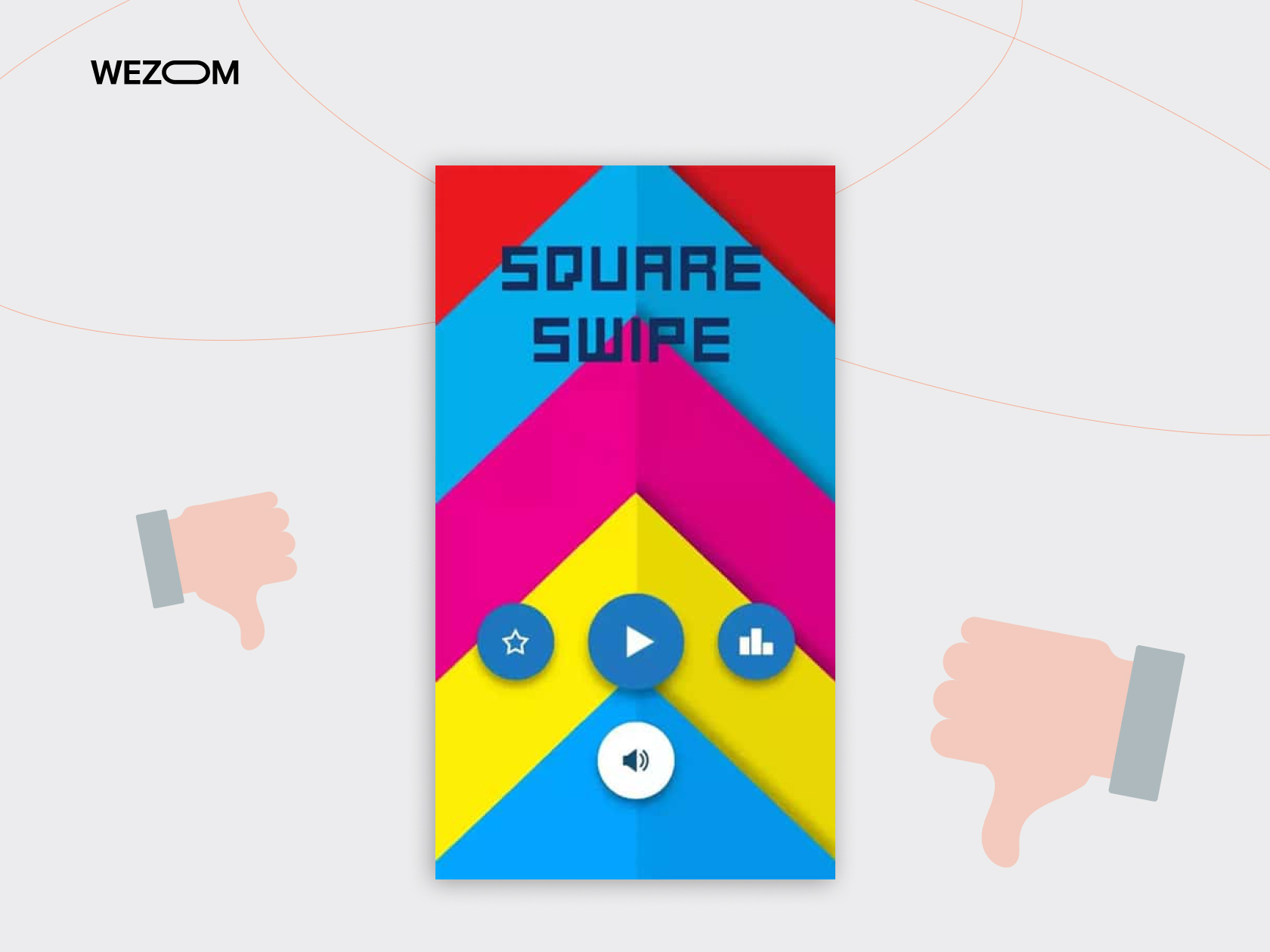
For example, the Square Swipe design lacks contrast. All elements blend into a visual mess. It is difficult to point out separate elements quickly.
There are several principles that help to achieve visual balance as a part of the design:
|
Symmetrical |
Achieve visual balance through symmetry between elements. |
|
Asymmetrical |
Achieve an engaging look via dynamic visual hierarchy. |
|
Radial |
Emphasize the critical element and center UX around it. |
|
Mosaic |
Create an appealing pattern for many visual elements. |
You can achieve symmetrical balance if you mirror the visual elements on vertical and horizontal axes. Also, too much symmetry can make the design monotonous.
Asymmetrical design can help to avoid monotony. In asymmetrical balance, heavier elements are placed before lighter ones cohesively. This approach allows the execution of dynamic, lively designs.
Radial balance is an uncommon but viable solution. You place heavy elements in the center of the screen and lighter ones around it. This approach works best if you want to attract the user’s attention to a critical app component.
Finally, you can apply the mosaic balance if your app has many elements. This approach implies creating a pattern in which visual elements appear before the user. It may take longer to execute than other balance methods. Yet, the result would be a neat and well-structured visual design.
It should be pointed out that the presence of visual tension does not indicate a bad UX design from the start. Designers can use visual tension consciously to highlight a particular element of the app.
It is important to remember why you use a specific technique and what purpose it will achieve to keep all these mistakes at bay.
Inconsistency and Poor UX Accessibility
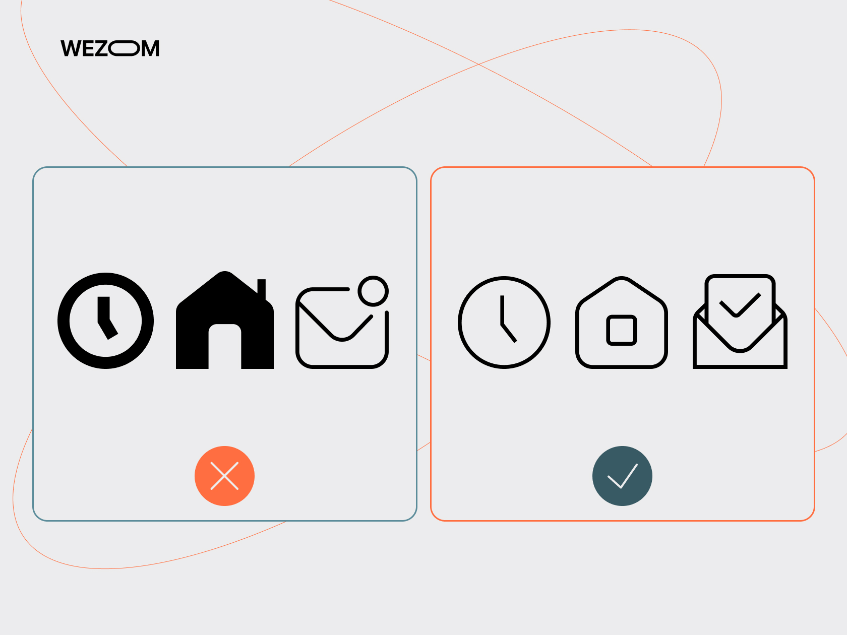
Inconsistent design implies that app elements are disharmonious or do not reflect necessary functionality. The result is visual and functional inconsistencies.
The app may have small text, which is hard to read. Button layout can be confusing and mislead the user in the app’s path. Some style choices can lead to the issue when certain apps’ functions become imperceivable. All these problems diminish from the final experience.
It is important to remember that the app is a dynamic product. Even if you have nailed the design from the first attempt, it does not make it fail-proof. Consider providing regular rundowns and notifications to inform your design decisions for users when you change the app.
If you introduce new features and replace old ones, you must notify users about this change within the app. Demonstrate where new elements are placed and how users can interact with the old ones. This approach will help retain the user’s attention and engagement with the app.
Poor Connection Between Visual and Technical Aspects of the App
The technical aspect of the app and its visual part are intertwined closer than you may think. Complex visual elements or files that are too “heavy” can create a poor user experience.
Naturally, potential customers with flagship devices will have no difficulties. Yet, if you aim for big success, you need to consider a wide range of devices, including older and less powerful models.
Conduct performance testing on different devices to see which part of the app shows the poorest performance. Consider changing the format of a heavy image to a vector one or vector animation. File compression can also help optimize an app’s performance.
Do not add more widgets that the app really needs. A desire to make the app stand out, but visual appeal can harm the overall user experience.
Finally, consider a modular approach to your app’s architecture. This approach allows the creation of responsive design elements and improves the user experience.
Cluttered Interface
The question of the perfect information balance is always a sharp one. Place too much information, and it will cause user frustration. Showing too little information will make users search for what they need for too long.
You need to understand that the interface helps to solve the user’s need for which they opened the app. A user's path from the starting screen should take no more than three clicks in an ideal scenario. Web design principles may not work in this case.
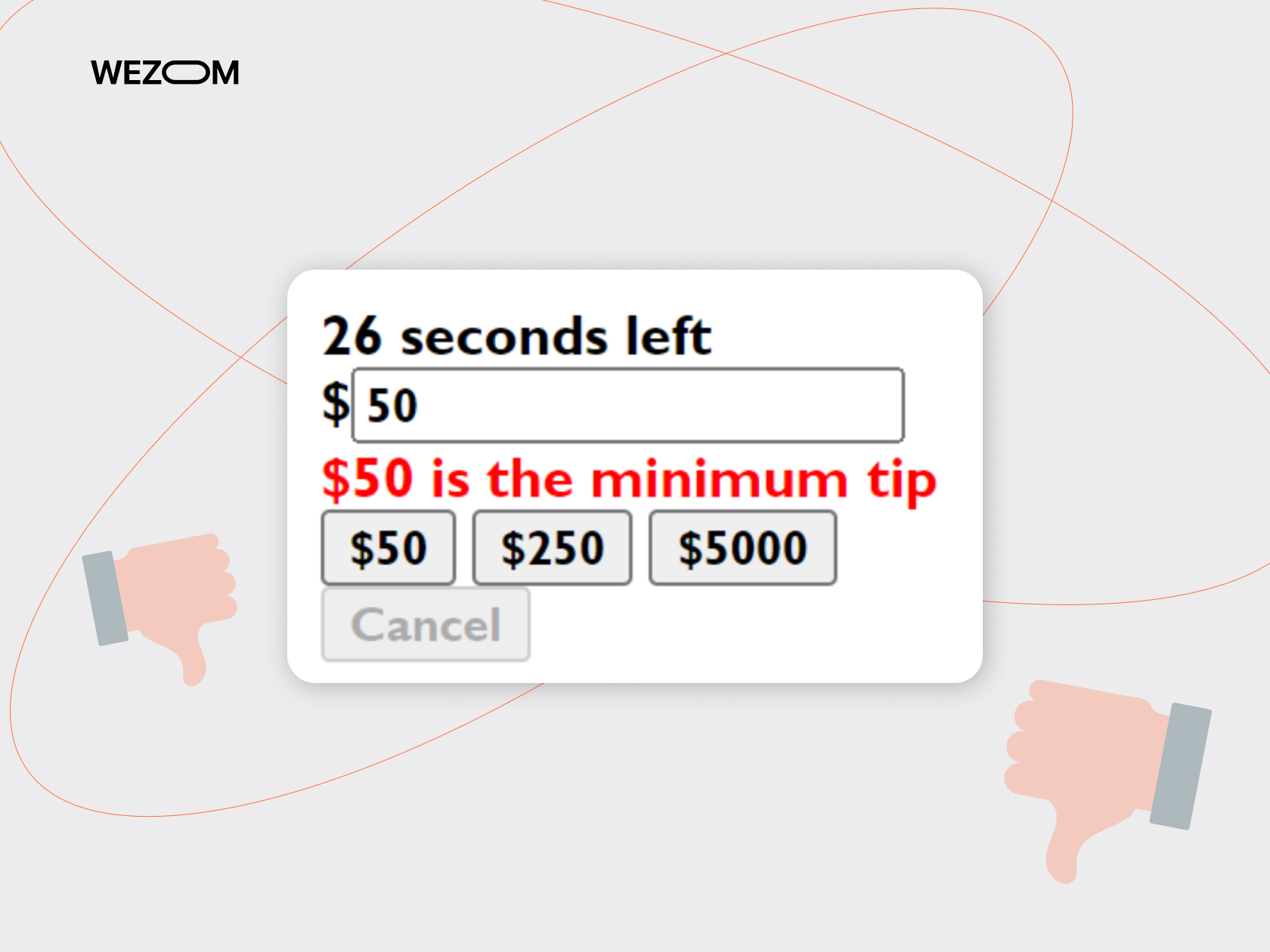
If your screen is too cluttered, separate it into several swipes. If your screens lack vital info, you should revise the design. But what information really matters?
Lack of Vital Content
Unless you make a game or an idle clicker, your app should satisfy a need or solve a task. This focus will be your guiding line to avoid UX design mistakes.
When you develop a design, you should constantly ask these questions:
- What task does this element solve?
- Will it help the end user?
- Does a particular design choice align with the overall purpose of the app?
- Can you provide a more intuitive way to present a feature?
It is also important to remember the context of an app, in addition to its content. An app for fitness needs different design principles than an app for financial trading.
For example, a fitness app can track a user’s progress in exercising and burning calories. This app should have all the relevant information on the home screen. Besides, its buttons should be large and have short text.
Also, the operations within the app, such as logging activities, should be executed only in a few taps. Presets will be an optimal solution for this task.
By the way, we have experience in developing a fitness application, check it out in this case:

Let’s look at another case - an application for financial trading. The end user would be a professional trader who needs as much information as possible to make profitable decisions. The app works with a huge amount of data, which should be reflected in its layout.
Multiple screens would be a great solution for such an app. Separate screens for market analysis, portfolio tracking, and financial news will meet user’s needs.
Interface customization and flexibility in the user’s hands will also help to make the important UX more personal. Trading habits reflect the user’s character. Customization within the app will help express it.
Traders tend to quickly scan information and make decisions based on multiple factors. Therefore, an intuitive layout with a few taps will help them in their daily trading.
You need to understand your user base for your app to succeed. But how to do that efficiently?
How to Process User Feedback Correctly
Sometimes, chasing an efficient design system can lead to unpredictable results. Minimalistic solutions and efficient layouts can confuse the users and make them uninstall the app. By all metrics, the design must be perfect. Yet, nobody from the target audience’s pool actually uses it.
It is critical to engage with the data and constantly test it. Try the following approaches and methods:
- Make hypotheses and stress-test them to find strong and flawed points.
- Run frequent A\B tests during the prototyping phase.
- Communicate with the design team.
- Monitor the statistics of application usage.
- Consider the feedback that users leave on marketplaces.
These steps will bring your product close to your audience and, in turn, make a chance to become an app that is not removed even after the device’s change.
When you do interviews, prepare the questions beforehand and make a comprehensive list covering different aspects of user experience. Use the knowledge based on user feedback when you communicate with test groups. It is also important to remember that what people say does not always mean what they need.
When you process feedback, remember that saying about something and really needing it are different things. In most cases, users say that they need something, while in reality, they underutilize the said feature. Users mention the lack of the element in a test due to a consensus regarding design for mobile devices but not their observation.
The road to a perfect design is a winding one. Ensure you and your users are on the same page about the changes made.
Great UX Design Examples To Learn from
Let’s venture from the other side. Looking at good UX examples would be a positive contrast to learning not only from someone’s mistakes but also from success.
GloYoga
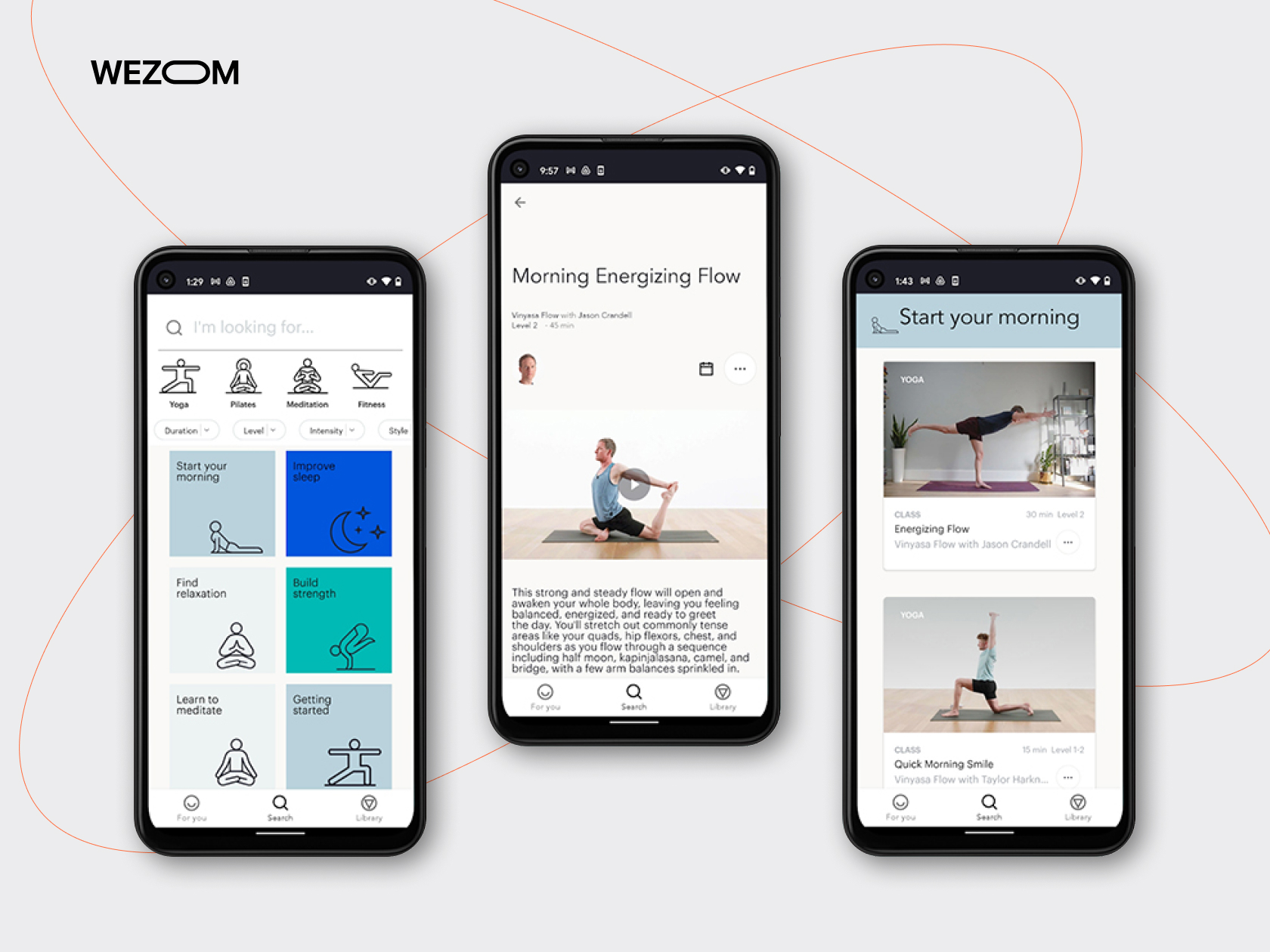
GloYoga is one of the most successful apps in Google Play and AppsStore. The appealing design did not play the last part in it. The app masterfully combines minimalistic mobile design with enough information, symmetrical visual balance, and awareness of the context of usage.
Dragi
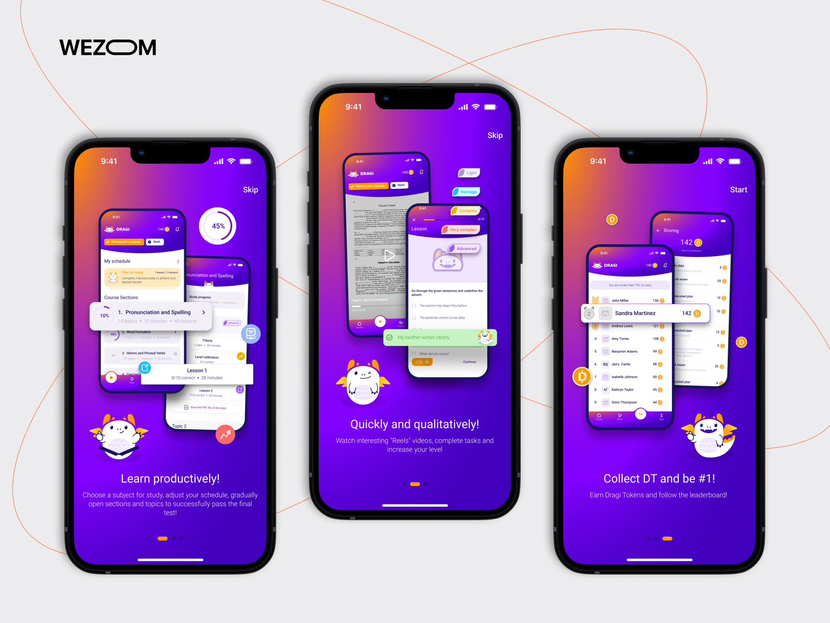
Dragi is another example of a well-executed UI\UX design. The app uses color contrast to highlight important elements of the app. It also respects the user’s time and makes the user's journey to the desired screen swift and comfortable.
Dragi’s educational screens do not waste time and provide all the relevant info for a student. Queez screens have easily readable text with big buttons. Unique ideas and consistency across various elements allow Dragi to stand out among other educational apps as an example of a great design.

Spotify
Spotify is one of the most recognizable music apps that follows a minimalistic design trend. The whole app reminds me of musical player software from the past decade, but it has modern quality-of-life features.
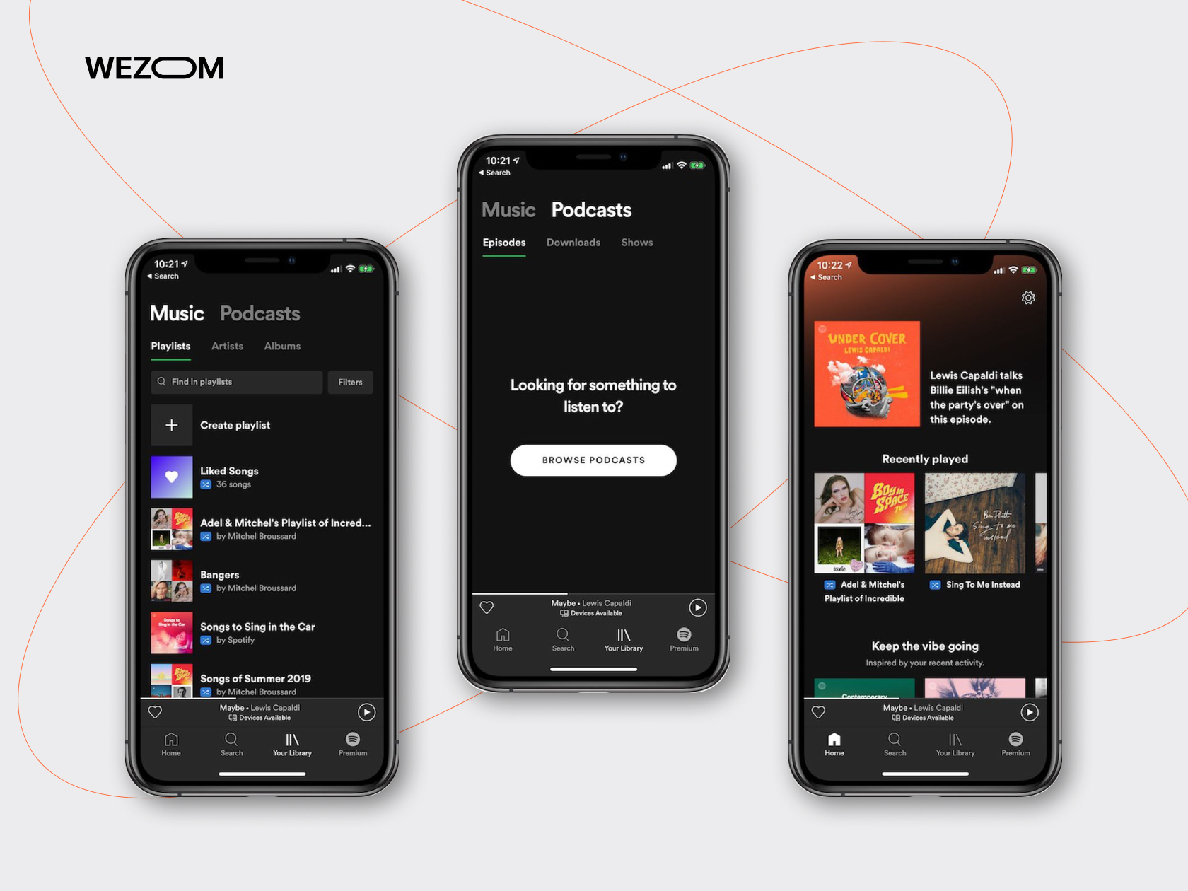
Users get their favourite tunes right from the start. It is easy for the user to reach additional features as well. Conscious usage of space and focus on the app’s primary function makes Spotify’s design one of the most noticeable on the market.
Bottom Line
There are myriads of possible UX design problems. Yet, if the company you plan to hire manages to avoid the ones listed in this article, you’ve found a professional team.
Remember that the app should be visually balanced, and tension should be used smartly. Work on accessibility and consistency within the app. Provide only vital content and shorten the user’s path where possible.
Finally, leave room for improvement. Search for feedback and implement constructive criticism. With these design practices in mind, avoiding these common mistakes would be easy. Your app will become what users keep even after changing their device.
You can order our service for design evaluation if you wish faster feedback. We will thoroughly examine your design and suggest constructive steps towards improvement.

