The global health apps market size was estimated at $14.84 billion in 2024. In 2025, we expect it to grow to $17.39 billion, while by 2034, it will reach a record $72.87 billion. This can be explained not only by the popularization of telemedicine and the rapid transition of medical centers to a remote service format – today, software development companies and medtech startups can easily launch stand-alone mobile software that covers basic health-related tasks, such as storing test results, creating diet plans, and much more that does not require serious medical expertise.
However, despite such inspiring estimates, to encourage users to choose your app against dozens of others, it is important to take care of the user experience, making it smooth and friendly for different categories. Below, as a company specializing in creating telemedicine interface designs, we will share our insights on this.
Why User-Friendliness Matters in Healthcare Apps

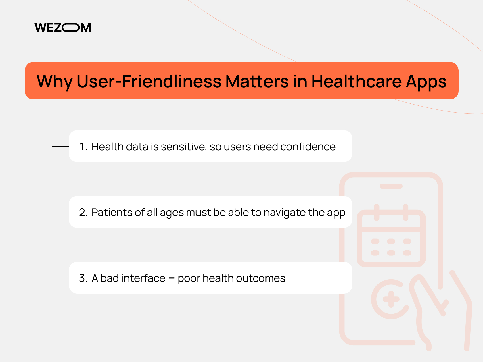
Based on our experience, we would like to highlight three main reasons that make us pay special attention to the healthcare app design during the development process.
Health data is sensitive, so users need confidence
When using a healthcare app, a patient most often provides it with confidential information, including diagnoses, lab results, medication schedules, etc. At the same time, if implemented incorrectly, the user interface can easily cause mistrust due to ambiguous wording, overloaded screens, lack of secure login and data flow, etc., thereby alienating the lion's share of the audience who would like to get a more reliable product for their needs.
Patients of all ages must be able to navigate the app
In the health care sector, the interface should be equally understandable for both young people who are quite experienced in interacting with digital products and pensioners who simply need to track their vital signs without unnecessary complications. Therefore, if the interface is sophisticated, requires complex actions, and carries a high cognitive load, this will lead to errors in use and subsequent removal of the software.
A bad interface = poor health outcomes
An ineffective reminder system, lack of visual cues, complex forms to fill out – these are just some of the typical user interface errors in health care applications that prevent patients from following doctors’ recommendations. As a result, healthcare app UX can indirectly affect the results of therapy, both positively and negatively.
Key UX Design Principles for Healthcare Apps
To create a flawless mobile health app user experience from project to project, we use the following principles in our work.
Simple and clear navigation
Navigation is one of the priorities in creating an effective user experience in a healthcare application. In particular, we pre-build user flows so that users do not have to think about where the desired function is, whether it is an appointment with a doctor, viewing test results, or something else. We also ensure compliance with the rule of “maximum 3 clicks to the target action”, exclude “burger” menus, and, in general, use navigation patterns familiar to the vast majority of users.
Accessibility for all age groups
Your app can be used by people of different ages, which means that its interface should take into account age-related perception features. In particular, to build a senior-friendly app design, we use large fonts (from 16 px) and provide good contrast. We also minimize the number of animations and decorative elements that interfere with perception and present all text components in simple language, without professional terminology. In addition, if the client wants to ensure high accessibility in healthcare apps, we can implement voiceovers for interface elements or voice control support.
Quick adaptation and onboarding
Onboarding for medical apps should be fast. To achieve this goal, we usually create 3-5 screens with express training through swipes, highlight buttons with target actions, and offer users the option to skip training with the ability to return to it if necessary (for example, from the main menu or FAQ section). We also recommend using built-in tips, especially in modules with increased cognitive load, such as those dedicated to managing health insurance.
Visual hierarchy
Buttons like “Schedule a visit to a doctor” or “Contact a doctor online” should be a priority in the visual hierarchy. To ensure this as a part of the patient-centered design, we create CTA buttons in contrasting shades that do not duplicate secondary elements and place them above the fold. We also often use the F- or Z-patterns or pin buttons to the bottom navigation.
Multilingual support
In countries with a multilingual population or in the case of international services, interface localization is a must. In this regard, the interface should be initially adapted for scaling (in particular, a German or Finnish translation can be much longer than an English one). It is also important not to forget about the localization of units of measurement, date/time formats, and currency symbols.
Of course, this is far from a complete list of the best practices for healthcare apps that we use. If you want to implement all our knowledge and relevant experience in your application, write or call us, and we will take on its implementation.
Balancing UX with Compliance and Security
Healthcare software often processes sensitive data, which requires both a smooth UX and compliance with HIPAA (in the US) and GDPR (in the EU). So, let's take a closer look at the considerations on app design for chronic care management in this context.
HIPAA/GDPR design considerations
In short, these regulations say that you cannot collect unnecessary data, cannot store it unsafely, and cannot mislead the user. Therefore, to build a GDPR- and/or HIPAA-compliant app interface, you will have to notify users every time about the purposes of data collection, formulate clear and transparent consents for processing (without hidden checkboxes), and exclude optional fields in registration forms. In addition, you must provide the ability to delete personal data or download it as an archive. Given all these complexities, it is better to model the user flow from the very beginning, taking into account legal triggers, so that notifications and consents do not interfere with the main use case, but remain visible.
Secure logins (2FA, biometric)
UX and security are quite difficult to implement together, but in the healthcare sector, neither can be sacrificed. To overcome this challenge, we use two-factor authentication via SMS/push notifications/email or biometric authentication – for example, via Face ID or Touch ID, which is relevant for mobile software. In some cases, we can also offer to implement authorization by eID or through the public services system.
Privacy-aware user flows
Finally, you must not only guarantee secure data storage but also prevent it from being shared with random people. To do this, we implement automatic logout by timer, sometimes disable the preview of push notifications, and also create separate screens for displaying sensitive information (for example, test results or diagnoses), which open only after confirmation.
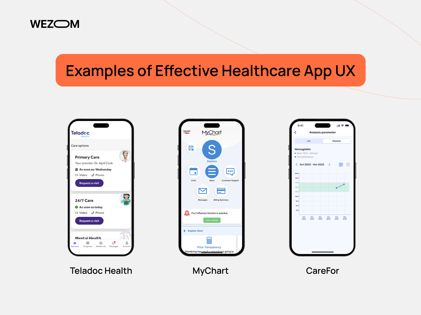
Examples of Effective Healthcare App UX

The best way to understand what really works in healthcare UX is to analyze successful cases, which is what we will do now.
Teladoc Health
Teladoc is one of the largest telemedicine service providers in the world. The UX of this application has become a benchmark for the market due to its simple navigation (the main screen offers three actions at once: “Start a visit”, “Add symptoms”, and “View results”; there is no cognitive overload as everything works intuitively), support for emergency use cases (less than five steps, which is critical for life-threatening conditions), as well as localization of the interface and its adaptation to different devices, both smartphones and tablets.
MyChart
MyChart by Epic Systems is one of the most popular health monitoring apps in the United States. The main UX achievements of this software include a multi-level visual hierarchy that covers test results, prescriptions, appointments, and messages from doctors, the presence of a family access mode, integration with wearables for real-time health monitoring, and automatic prompts for actions.
CareFor
CareFor is our project, which is presented in the format of a mobile application and serves both as a safe storage for medical research results and as a tool for tracking their dynamics. In the application, we implemented multilingual support, created a separate section dedicated to privacy policies, and provided visualization tools for tracking progress based on medical test results.
In general, all these platforms prove that effective UX in the healthcare sector is ensured through a balance between informativeness and clear logic of actions, especially for an older audience and people under stress.
Mistakes to Avoid When Designing Healthcare UX
Even if the functionality is unique, some mHealth app UX design mistakes can completely devalue your product.
Cluttered dashboards
It can be difficult for a user to understand what is important to do right now. To avoid such situations, we build a visual hierarchy with priority CTA elements (for example, “Make an appointment with a doctor” or “View test results”) that are large and located at the top of the screen. At the same time, we hide secondary information behind tabs or use the “expand” principle.
Complex language
Users can get confused by medical terminology, so to prevent this, we add informative icons and tooltips, and also decipher complex terms (if they cannot be avoided) in the interface. In general, we try to use human-readable language and infographics – for example, instead of “anemia” we write “Low iron levels in the blood”.
Long registration forms
Multi-stage registration with dozens of mandatory fields and document uploads leads to high user churn. To avoid this, we divide complex forms into stages (one stage – one screen), integrate authorization forms via government services, Apple ID, Google, or insurance policy when possible, and save progress so that the user can continue performing actions a little later.
How to Test and Improve UX for Your Health App
User experience in healthcare should always be tested in real scenarios. Below, we will share the standard approaches that we follow when creating UX for healthtech solutions.
Usability testing with patients
First, we build scenarios for people with different motivations and anxiety, i.e., for healthy users, chronically ill people, and the elderly. After testing the software in focus groups, we conduct contextual observation by determining, for example, how patients use the application when they have a fever or vision problems. The metrics that we pay attention to include the time until the first target action, data entry errors, and abandoned forms.
Feedback loops and micro-interactions
At this stage, we integrate functions like “Is everything clear?” and create compact user surveys after key actions such as “Did you manage to find the right doctor?” or “Are you satisfied with the results of the appointment?” This helps us get detailed feedback from real app users.
Iteration based on session data
Finally, we use heat maps, watch videos of user sessions, and measure the time it takes to complete a target action. In addition, in all such projects, we conduct A/B testing – for example, for different versions of the doctor selection screen (for example, it can be presented as cards or in a list format), and also analyze the bottlenecks, in particular, if more than a quarter of users abandon step two in registration, we simplify it.
Conclusion
High-quality user experience in the field of digital health is not only about visual nuances but also about the continuation of care from a medical center or startup. At WEZOM, we build UX based on the logic of user behavior, our own best practices, as well as sincere empathy. This is what allows our clients to launch user-friendly healthcare apps that quickly become popular and sometimes save lives. If you are planning to create or update a healthcare application, we are ready to help you at any stage – just feel free to contact us.
