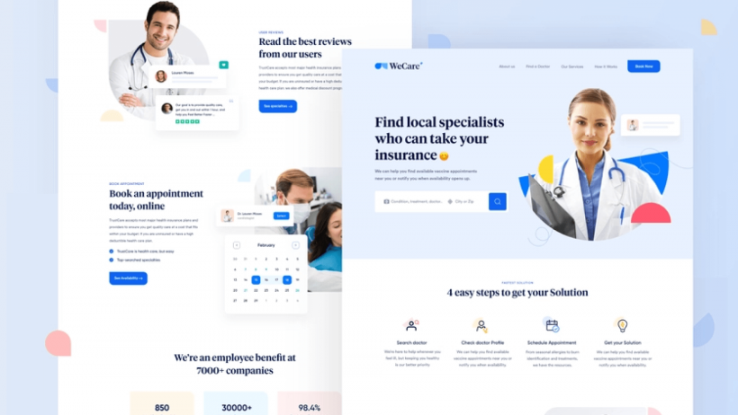
Exist numerous reasons why users don't stay long on your site. And there are equally many solutions to change this situation for the better. When creating a website that is comfortable for your users, you should not forget the specifics and direction of your niche and the wishes of your target audience. Speaking about the order of Healthcare – the industry that is now beginning to develop most actively, you need to understand several factors.
How to make a site convenient and useful to your customers and at the same time keep all the functionality, we will tell in this article. But to begin with, let's figure out why users only stay for a short time on your site.
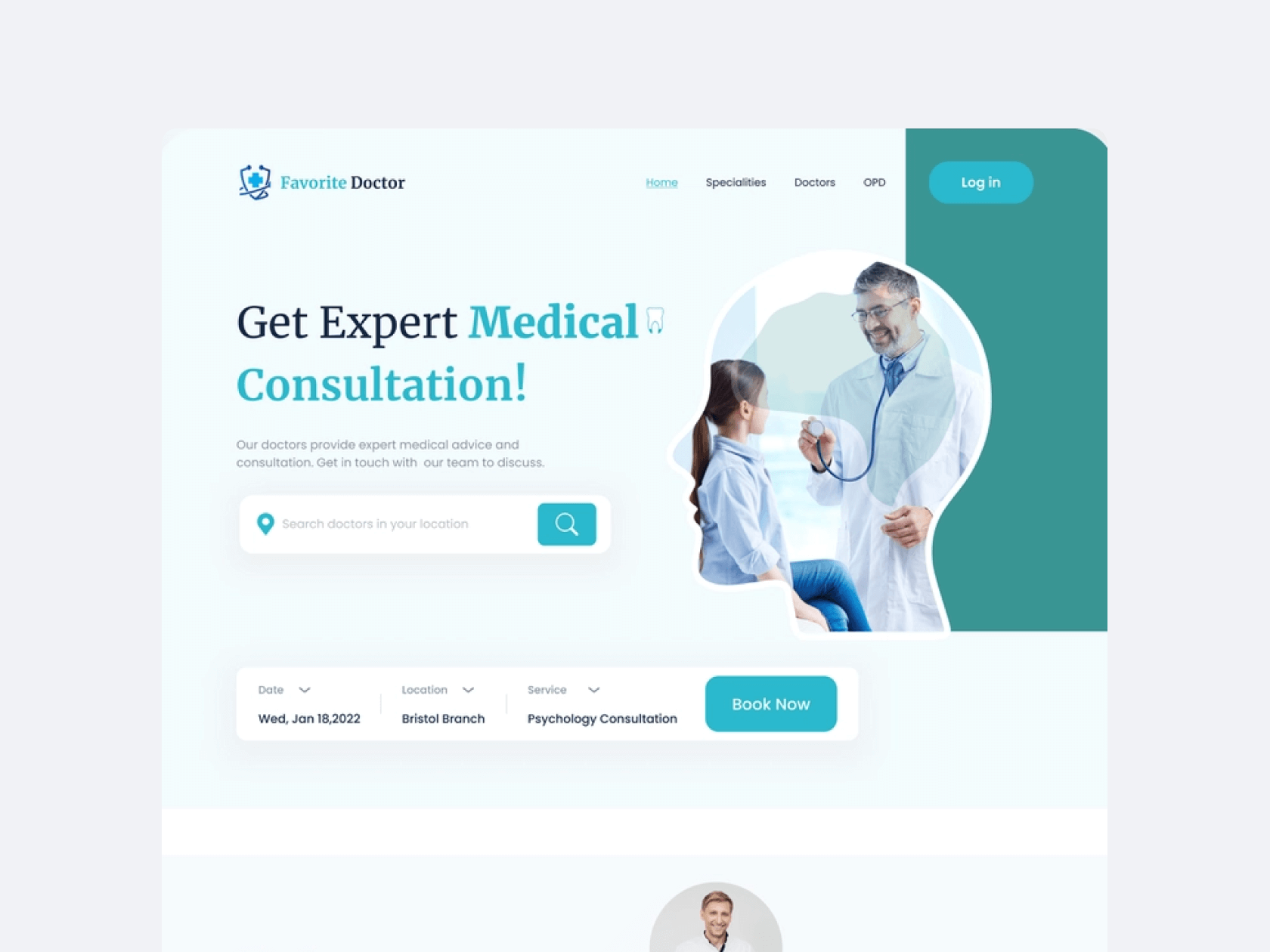
Top reasons why visitors leave your site
To fix the problem, you need to understand its root cause. So here are the top reasons why users quickly leave your web page.
- Slow loading. The number one reason on our list.If your page is slow to load, or if it just takes a little longer to load than other pages, the customer is 85% likely to leave it.
- Poor Navigation. If searching for the necessary information on the site takes too long, the user is likely to quickly close the page and try to find information elsewhere.
- Bad Design. Bright colors that crash into the eyes, the unreadable font – all these factors harm your site and make it unusable for users.
- Unreadable Content Structure. When users come to the site looking for information but don't find it, they are more likely to leave the page. Keep this in mind as you fill the page with the necessary information and structure.
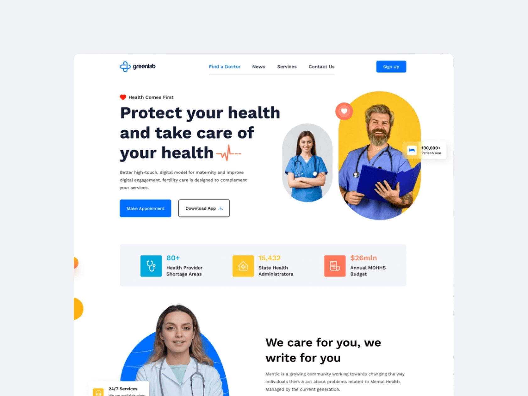
A site for the medical industry requires even more attention to detail in its content and structure. This will help site users more easily find the information they need, make doctor's appointments, get test results, change appointments, and so on.
Main Tips
When working with Medical Website, the first thing to pay attention to (and perhaps this is not news to you) is the needs of your target audience. The site should be simple and understandable not only for young doctors and patients but also for retirees, who because of their age tend to go to the clinic more often. So here are our simple tips for creating the best website for the Healthcare industry.
Intuitive Site Navigation
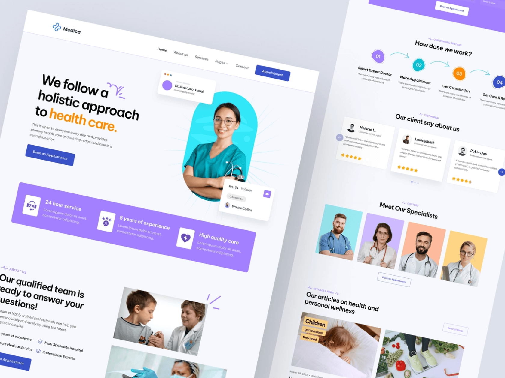
Returning to the items that cause users to quickly leave the site, the first thing to pay attention to is the simple navigation of the site. If it's a landing page, the structure should be consistent and clear. Distribute the information on your page so that if a user has a question while reading a section, he can find the answer in the next section.
For a quality website structure, use the correct layout from the copywriter, as well as a clear distribution of sections from the designer. Create a picture of the site so that your target audience won't have questions about where and what to click.
Add voice search to your site. This will make it easier for seniors to find the products they want. You can also add a search by symptom or disease.
Simple Search
Make the information on your site fully searchable. Add a bar to search for a specific word, or create a section of frequently asked questions for your users.
One of these two things should be on any site, especially if it's a medical site. For example, create a special bar to search for test results on a particular page, as well as a bar to search for a doctor's specialty. For even easier management, create a special page with instructions on how to search for a certain result.
Fast Load Speed
Point one – users leave the site if it takes very long to load. To do this, you need to make the loading on the site as quickly as possible. The loading of the page affects several factors and the most basic of them – it is optimization.
- Optimize images. Before you add an image to the site, compress it. This way it takes less time to load a site with lots of images.
- Optimize the video. On the same principle as images, you need to optimize the video on the page and video elements.
- Web cashing. Set up page caching for better usability and faster loading.
- Compress files. Also, don't forget to compress all of the files that you have on your site. Since a medical site will provide many files to work with, such as test results, you need to make sure that the files are compressed and easy to download.
Reviews Considering
Give users the opportunity to leave comments. Once you take feedback from your users into account, you can improve your site as well as your services. By allowing users to leave comments, you'll give them the feeling that their opinion is important to you.
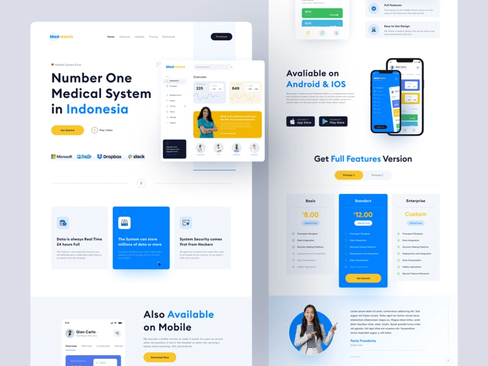
For better feedback to your clients, involve physicians in your clients' and patients' responses. When questions in the comments are met with answers from professional doctors, it will attract other patients as well.
Product Card
An important advantage on a medical site (especially if you are providing medicine to your patients) is the medication cards on a separate page of the site. That way you can immediately show patients what medication they need, and you can attach them to the patient's prescription.
Such cards with medications can also be developed and improved:
- Add analogues to each product card. So that customers can see additional options other than your suggested ones.
- They are selecting a dosage. Each card should allow customers to buy the product and choose a specific dosage for themselves, according to their intended use. Ideally, the doctor's appointments in digital mode should immediately pull up the product card.
- Filter by the manufacturer. Give your patients the ability to select products from specific manufacturers.
Format Suitable
Numerous medical sites need to be able to upload files in certain formats that meet the standards of international health systems. Therefore, check with the developer to ensure that the patient portal development will support certain file formats. For example, such as MedML.
Clear Contact Information
Don't forget to leave contact information on your site. Add a few required fields with important contact information:
Phone and email. The simplest thing that should definitely be on your site is information about customer service. So be sure to include this information.
Online scheduling tool. Prepare an online doctor's appointment form on your site. This will save you a lot of free time, and it will make it much easier for users to make appointments.
Physical address. And if your organization has a physical location or office – be sure to indicate this on your site, preferably with a map.
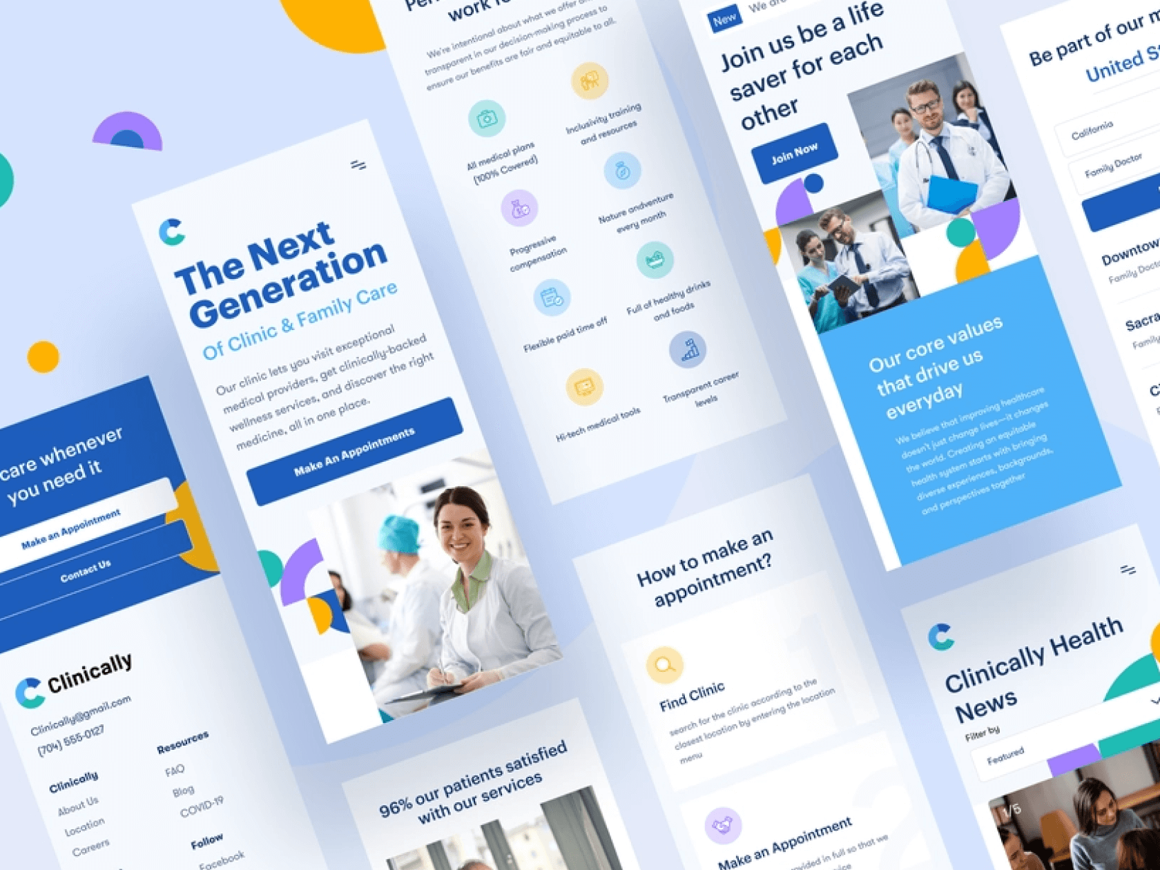
Don't forget to add order status notifications for your customers.
Mobile Friendly
And the last tip is to set up your mobile version of the site. Right now, about 75% of all users visit websites from their phones, not their computers. Therefore, pay special attention to the fact that the design of the mobile version of the site is fully configured for convenient use from the phone.
If you are still not sure how to make your website as convenient and automated as possible for your users, you can contact WEZOM specialists. We will help you build a model of conversation with your target audience through your future website.

