If you have ever been to Ukraine, you have probably noticed branded black refrigerators in supermarkets, from which well-packed marble steaks are seen that look particularly appealing. These are “Miastoriia” refrigerators, a Ukrainian brand of meat shops and restaurants.
The company was established in 2015 by the spouses Lesya and Andrey Usenko. The idea was to promote a high culinary culture in Ukraine, to create a “meat boutique”. The brand offers guests and customers fresh meat, delicacies, steaks, meat products and farm products.
This became the foundation of the company. The meat in her stores is not just a product for sale, a whole ideology of consumption is built around it. The business relies on two farms near Chernihiv, where feeding and caring for livestock is taken very seriously. “Miastoriia” stores are equipped with professional Himalayan salt dry aging chambers, where the required temperature, humidity and ventilation are maintained. It is under such conditions that the meat becomes “marbled”.
Before the coronavirus crisis, “Miastoriia” actively opened its own stores (in particular, a restaurant in the Kyiv Central Department Store) and cooperated with retailers, earning a reputation and recognition among its customers.
In 2020, the business not only did not stall, but also received an impetus for development. The company focused on the delivery of ready meals and semi-finished products, increased marketing costs by two and a half times.
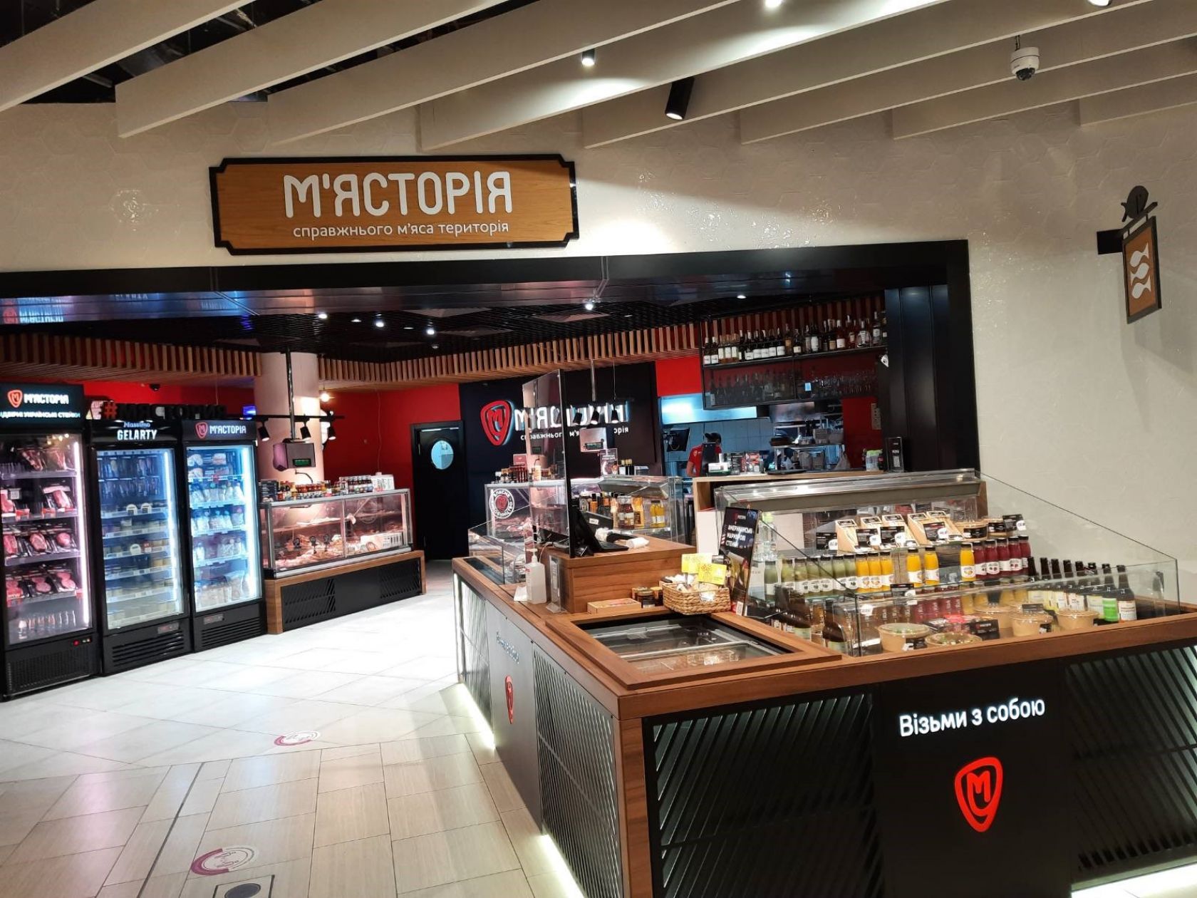
Shop "Miastoriia" in the Kyiv Central Department Store
Today, “Miastoriia” intends to make a digital revolution in meat retail, turning it into a powerful e-commerce industry example. The company launched “Myastoriya Shop” vending machines, where you can buy a steak using a QR code. The “Miastoriia” online store allows you to order fresh meat and pre-cooked products anywhere in the country.
But in order to bring all the ambitions to life, the company needed the development of a new cross-platform mobile application – a full-fledged “butcher's shop” in a smartphone. We helped it with this matter.
The Essence of the Project
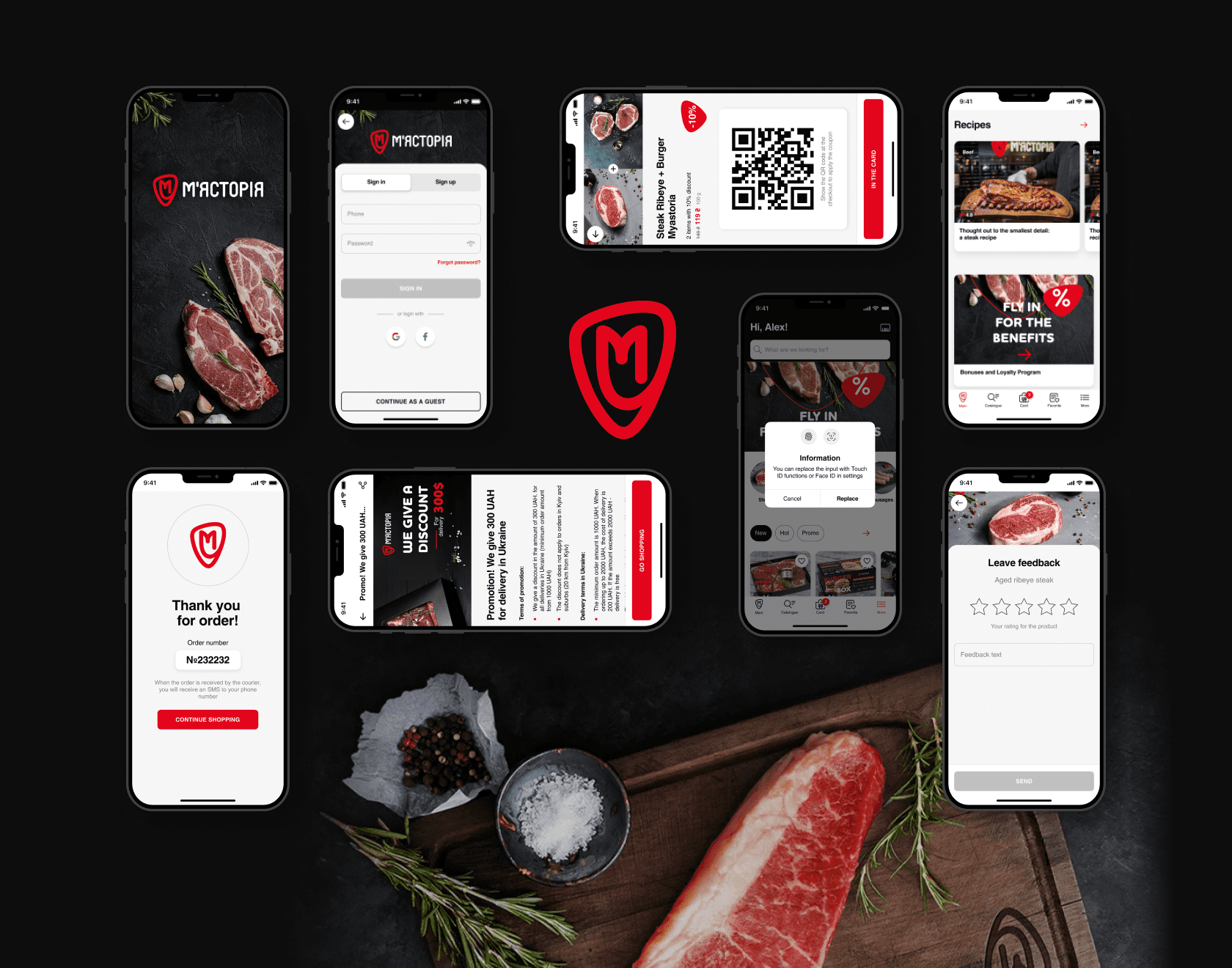
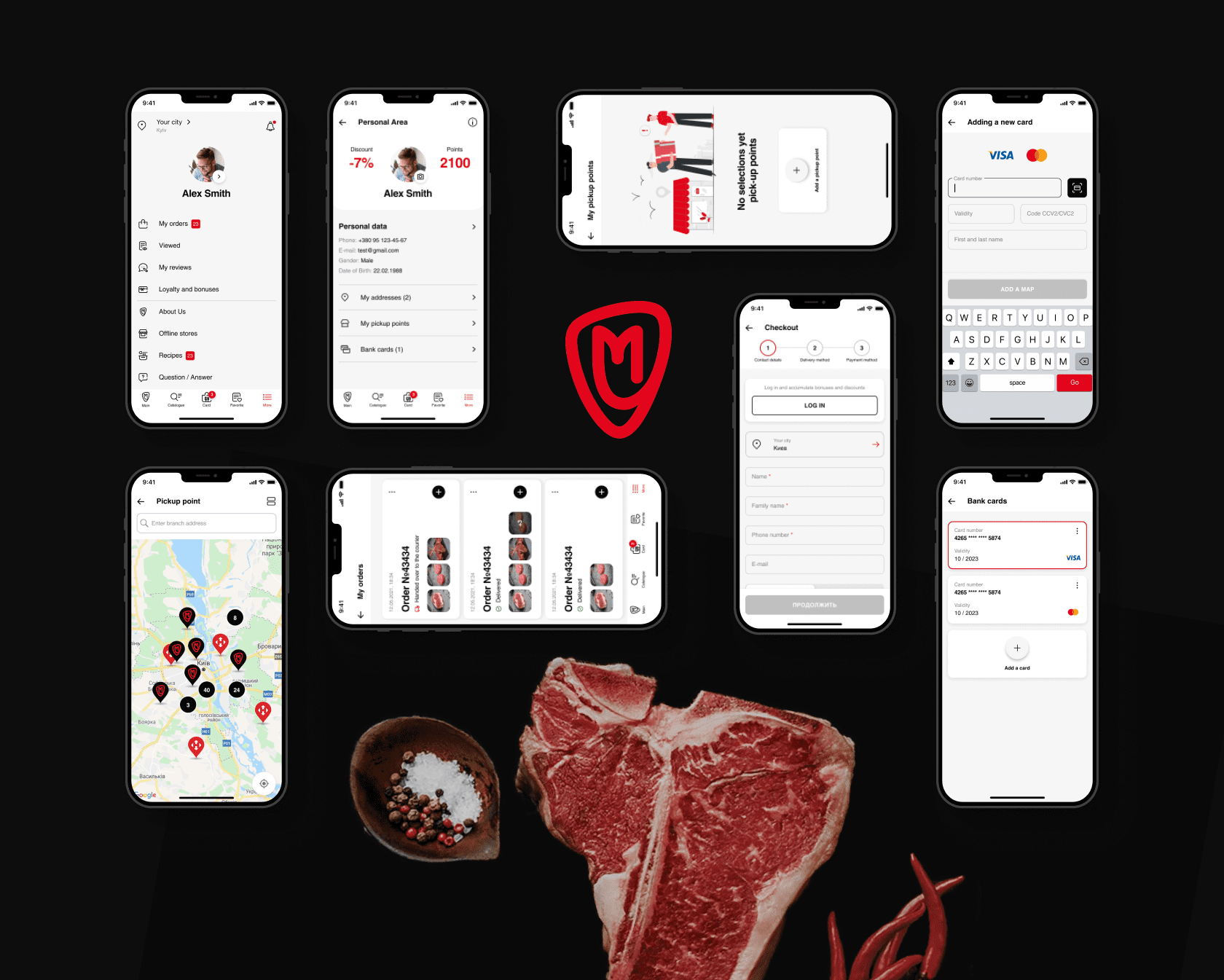
The concept of the entire project was aptly described by WEZOM developers as “Rozetka for meat”. (Rozetka is one of the largest and useful Ukrainian marketplaces) This is an application in which you can order the delivery of raw steaks or barbecue to anywhere in the country in two clicks - the product will arrive in a thermobox in one or two days. Delivery of ready meals is also available to residents of Kyiv and its suburbs, while the user will be able to choose the degree of meat roasting and use the full functionality of e-commerce: a wish list, a bonus program, etc.
The goal is to develop an application that combines the functionality of a classic e-commerce and an online restaurant.
The product should enable users to easily and quickly buy online, as well as provide tools for interacting with the “Miastoriia” chain of stores.
Tasks:
- Develop a new backend with the prospect of creating a new site;
- Create a mobile app store;
- Integrate the application with the iiko service for production control and accounting.
How Technologies Were Chosen
The client initially requested the development of a hybrid application in React Native, but during the discussion we settled on Flutter: it works faster and is better customizable.
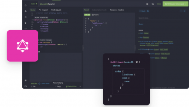
To implement the interaction between the frontend and the backend, we chose the well-typed GraphQL language - in the future, it will be possible to quickly and easily develop a new site for it. Oauth2 is used for user authorization, Firebase is used for push notifications.
The final technology stack looked like this:
- Flutter
- PHP
- MySQL
- GraphQL
- hive
- Firebase (Push notifications)
- Oauth2
How we built the job
Traditionally, work on the project began with the zero sprint, where the concept of the project was worked out. We figured out how the client sees the result of development, what tasks he wants to close with the help of the application.
Although the project turned out to be large, the team agreed to implement it in just six sprints - that's about five months. Usually such development takes 3-4 months more.
When everything became clear with the concept and deadlines, the designers stepped in. We proposed a prototype UX and finalized it taking into account all the comments of the client. Then the visual part was approved in the same way - the client chose one of the UI options proposed by the designers.
At the initial stages of development, the involvement of the client helped a lot - he made a detailed technical task for us. The team had only to detail it and start development. Already at the end of August, the work started to be in full swing.
How We Kept Reports
“Miastoriia” turned out to be an extremely conscientious client and carefully followed the development from the earliest stages. Initially, the team held a daily meeting with clients every day: the participants reported on what had already been done, discussed plans for the new day. Very soon it turned out that such a format “eats” too much time, so they began to call once a week.
For the convenience of control, the client got himself Trello, where the developers regularly reported on the work done and received feedback. So the development always went in the right direction. In the discussions, ideas of new features and improvements arose - some of them were implemented immediately, some were postponed to the future.
Let's be honest, it was not easy for the developers in the project. There was little time, the client always studied the scope (the content of the project work), made sure that everything was perfect at the end of the sprint. This is a tough approach, sometimes even stressful. But the most important thing here is the involvement of the client side in the project. As a result, it helped the team avoid a number of mistakes and make the most useful product.
The Problem of Timing
The most important difficulty of the development was its tight deadlines. Projects of this magnitude usually require 7-9 months of work, but we set ourselves the goal of completing it in 5-6. To invest in deadlines, the team had to solve several tasks at the same time.
“The biggest problem is timing. We had to do it in six sprints. To make those six sprints, we had to do all sorts of absurd things. Let's say the page "Thank you for paying!" on the third sprint, and the payment itself – on the fifth…” – head of mobile Mikhail explained.
In order to save time, the developers undertook to write both the application and the backend at the same time. At the same time, the application always lagged behind at least one sprint: first, certain functionality was made on the backend, and only then, in the next sprint, the frontend caught up with it, rendering the necessary screens for the already written functions.
The same was true for testing. As a result, the development was carried out according to the principle of either a “locomotive” or a “ladder”, where the backend always ran one or two steps ahead.
On the one hand, it accelerated the entire development. On the other hand, in the first sprints where the backend was developed, it was difficult to show the client tangible results.
How to prove without a frontend that the functionality of adding a product to the “cart” has already been written? It helped that the client was tech-savvy. To demonstrate the results in the first sprints, we opened the API for the client: in FraphQL this is very conveniently done through the Playground. So he could make sure with his own eyes that the system accepts and returns the parameters necessary for the “basket”.
It was only at the third sprint that the first APK assembly appeared in the project (in fact, a workable application), where you could watch the screens and check the functionality.
What Have We Done?
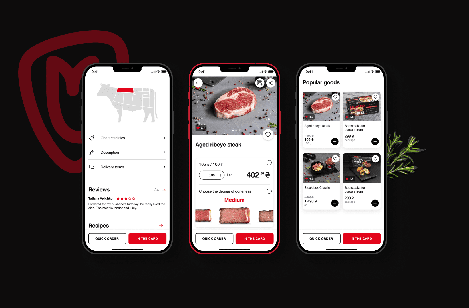
One of the main features of the “Miastoriia” application is the combination of the functionality of an online restaurant and an online store. If raw meat in a thermal box can be delivered anywhere in the country, then the delivery of ready meals is available only in Kyiv and its suburbs.
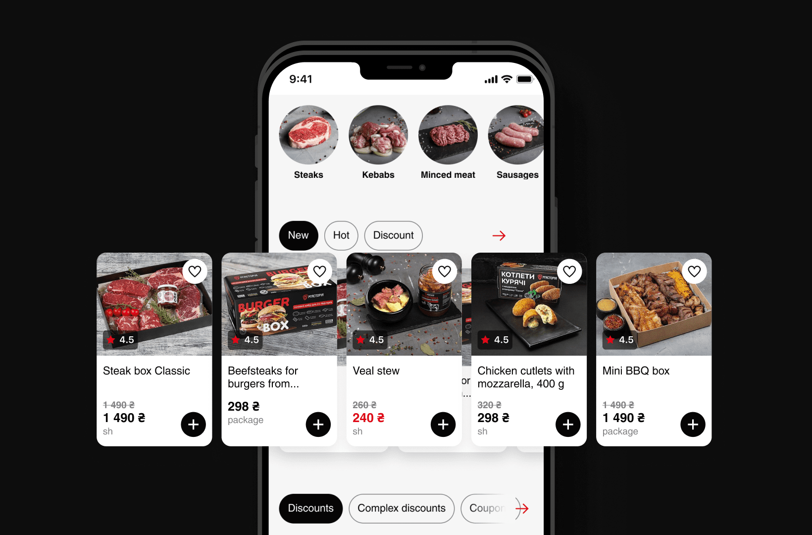
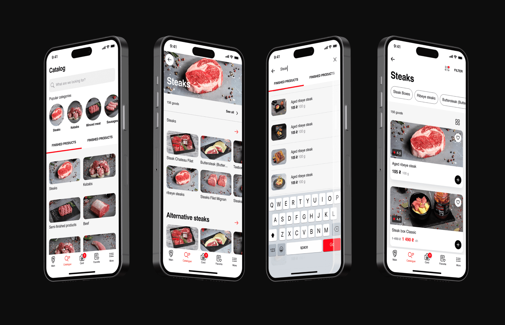
Separate directory
When the user enters the main screen, he receives a request to determine the geolocation, or chooses his own location. This directly affects the available assortment.
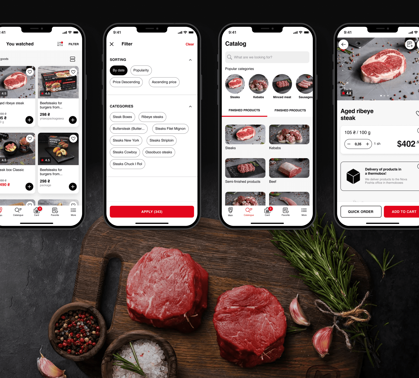
The product catalog of the application is divided into two main sections: finished and raw products. In the category of finished products, a restaurant assortment is available. In the raw category – meat, pre-cooked products, vegetables, farm products and more. The user has access to flexible sorting and filtering options in the catalog.
Showcases and popular categories
One of the main tasks of the application is to adequately present the products of “Miastoriia”. Fortunately, this is the case when the product can “deliciously” present itself.
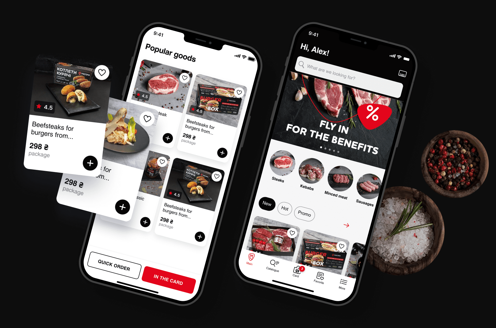
On the main screen, there is a block of the most popular product categories and a module of showcases with different types of goods. By clicking on the arrow of a particular showcase, the user enters the corresponding section of the catalog.
In addition, at the bottom of the start screen there is a “Popular Products” module, which displays products with the highest user traffic and the highest number of purchases. All this once again urges the user to go to the product card, and there it’s not far to the purchase.
Recipes
The application has a block of recipes that can be linked to individual products and ready meals. The recipe block can be found on the main page, and the recipe linked to the product can be found in the product card. Let's say, go to the Ribeye steak card, and you immediately see an illustrated instruction on how to cook it.
The recipe itself includes many detailed steps with many photos. You can go to the block of ingredients, where they are all conveniently listed in the form of a table.
Synchronization with iiko
The “Miastoriia” app is fully synchronized with the iiko software for HoReCa accounting. The nomenclature created in the program enters the application automatically. Orders generated in the application are also automatically entered into the system.
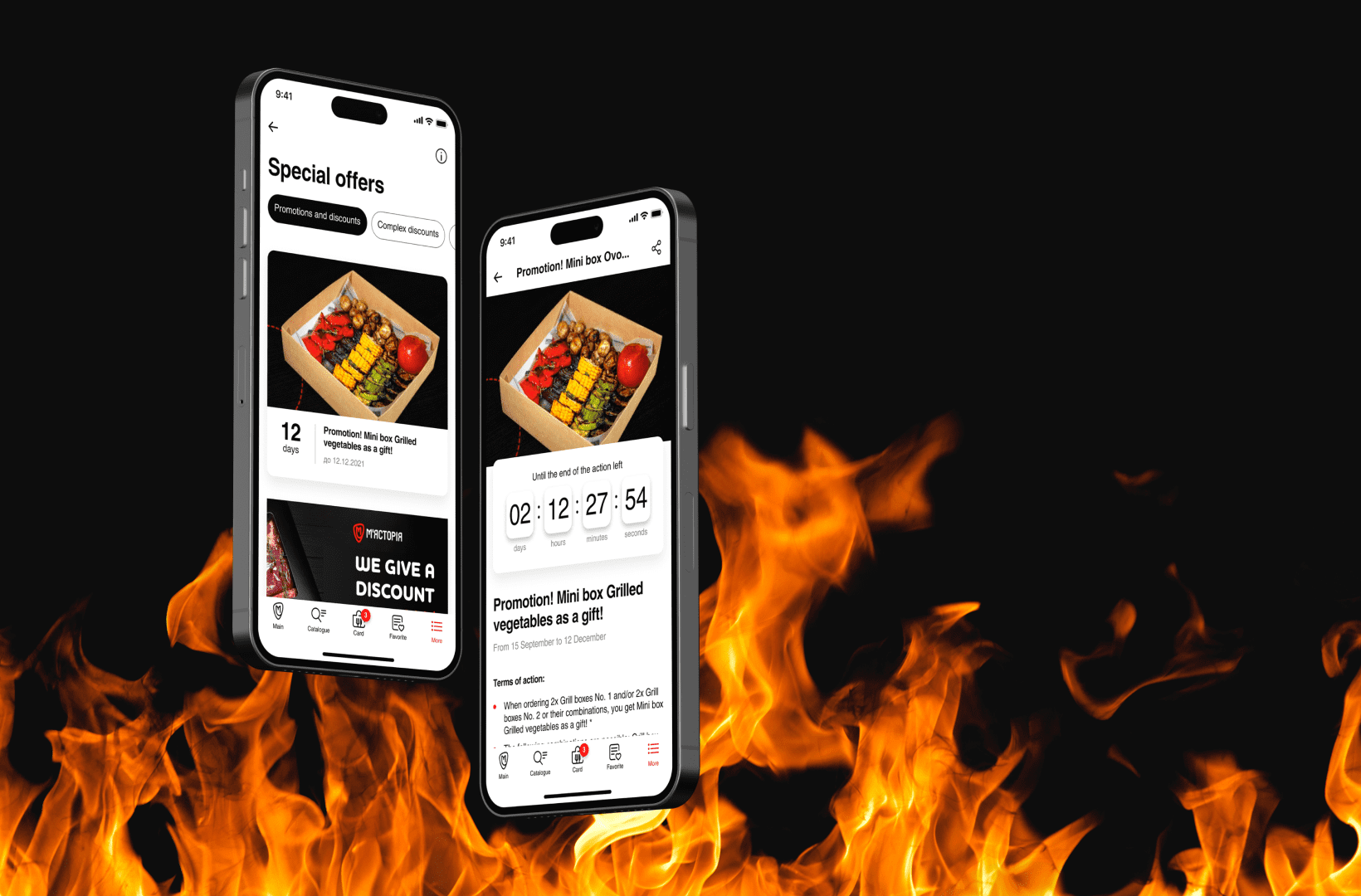
When a new client registers in the application, their data is pulled into iiko. The software can transfer information about promotions to the application, and users can accumulate bonus points that can be used when making a purchase. Bonus program data is also synchronized.
In addition, the program transfers to the application data on the balance of the item with an indication of its storage location.
Thanks to this integration, the new tool was able to be integrated into “Miastoriia”'s operational processes at minimal cost. Staff can easily manage the app through the new admin panel.
Development Summary
Now the product is being polished before the release: the team is completing the latest improvements, fixing the latest bugs found. The developers are proud of their work. In a short time, they managed to create a product with a strong architecture that can be developed and maintained for years.
Already during the process of development, the team implemented many new elements in the application. And after the release, it is planned to add a number of new features for the convenience of the user. Let's say, the transition according to the characteristics through swipes.
The new GraphQL backend in the future will allow “Miastoriia” to launch a new website at minimal cost and give rise to a more complex digital ecosystem for the business. The developers have optimized the load on the system as much as possible to ensure its speed and stability.
Finally, the app boasts a modern custom design with a thoughtful and clear UX. Buyers get the opportunity to order meat with delivery throughout Ukraine in two clicks, without tedious walks through supermarkets and meat markets. And this is another small but very tangible victory for e-commerce in the fight for the buyer.
Results
And now let's talk about the results for the Client:
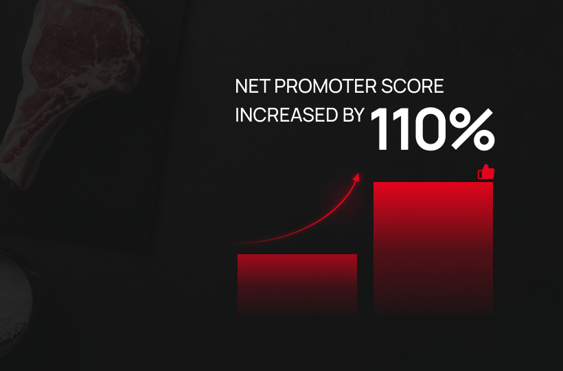
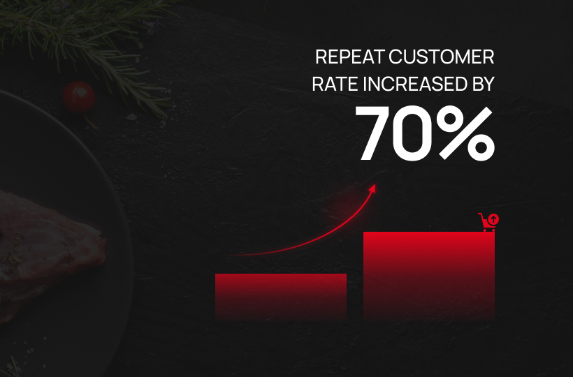
The new application improved the convenience of ordering, which undoubtedly affected the client's business activity:
Want similar results? Contact our team today and we can tell you what solution you need.