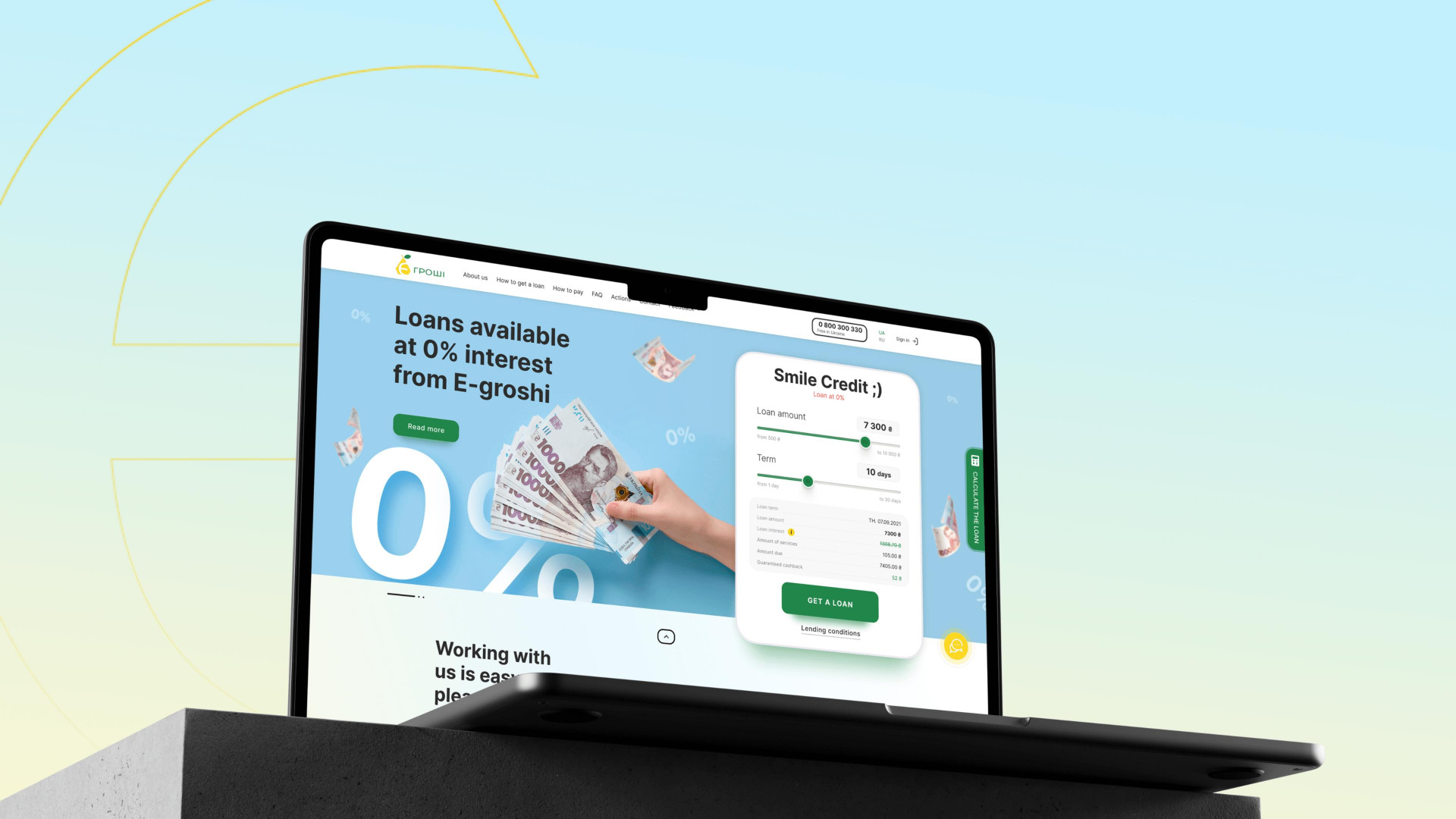
In a month and a half and in three stages, we created an updated product with positive effect on the e-groshi service.
About E-Groshi in Short
E-Groshi is a Ukrainian microcredit company that is popular because of its round-the-clock services, does not require a lot of data, and quickly issues loans, showing its loyalty to the clients. The company also provides a convenient system of interest accrual and the opportunity to calculate the loan amount independently.
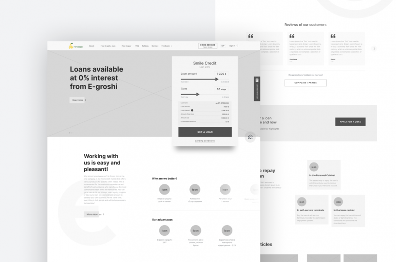
The company had its own development team but decided to contact an outside company with an expert opinion
Our Design Solution
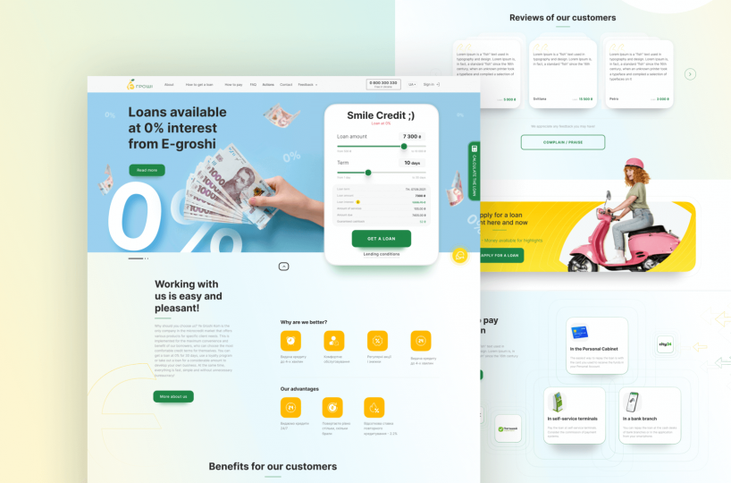
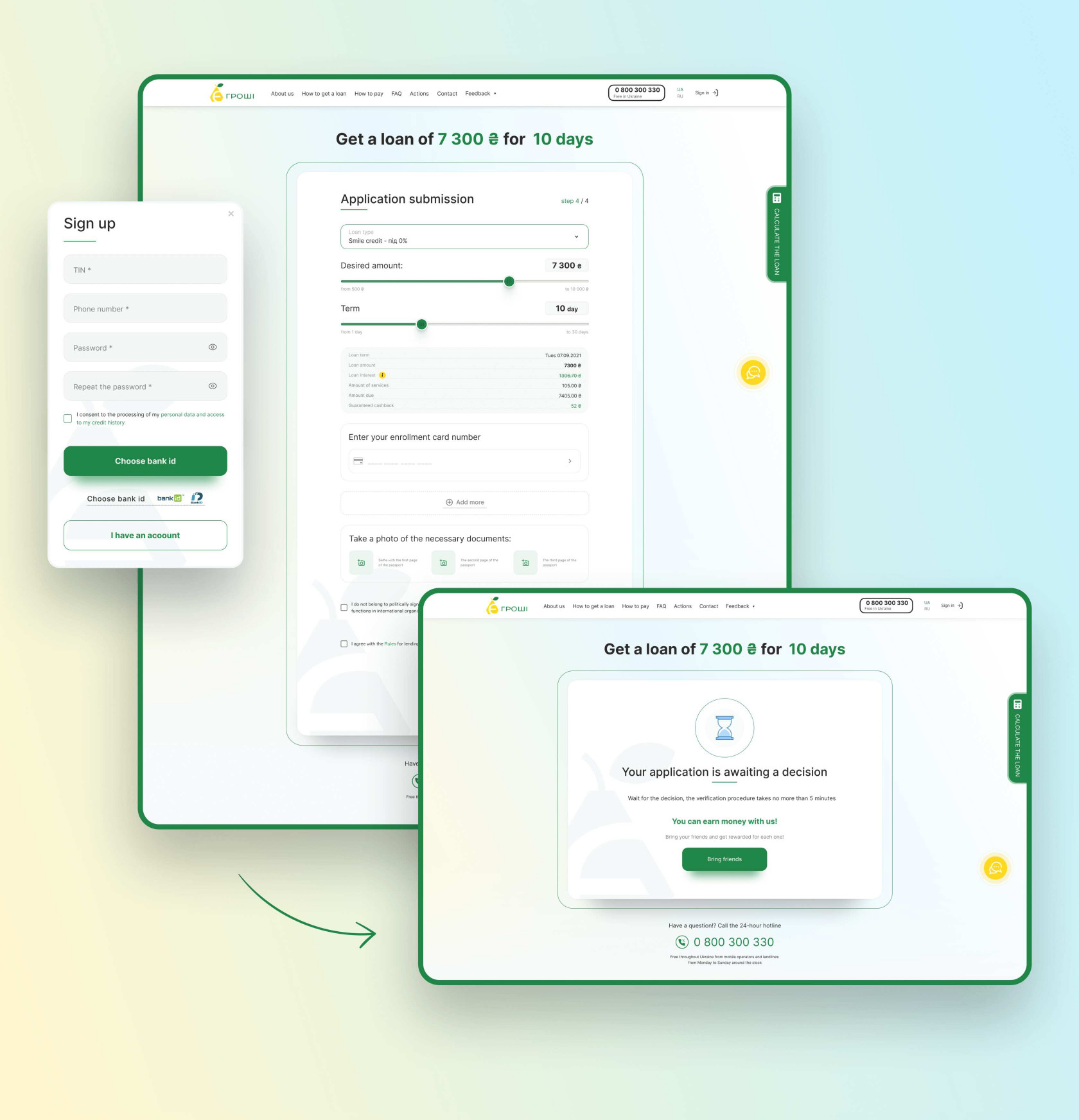
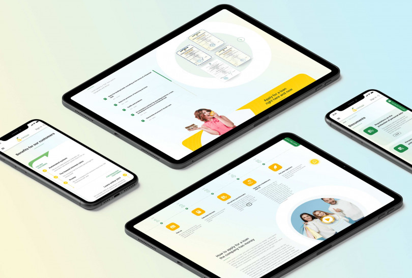
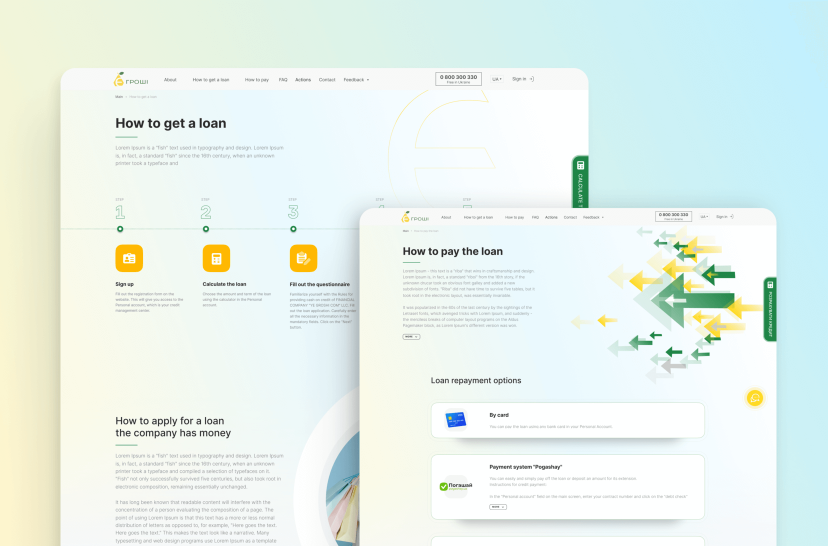
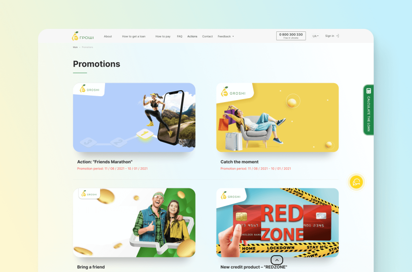
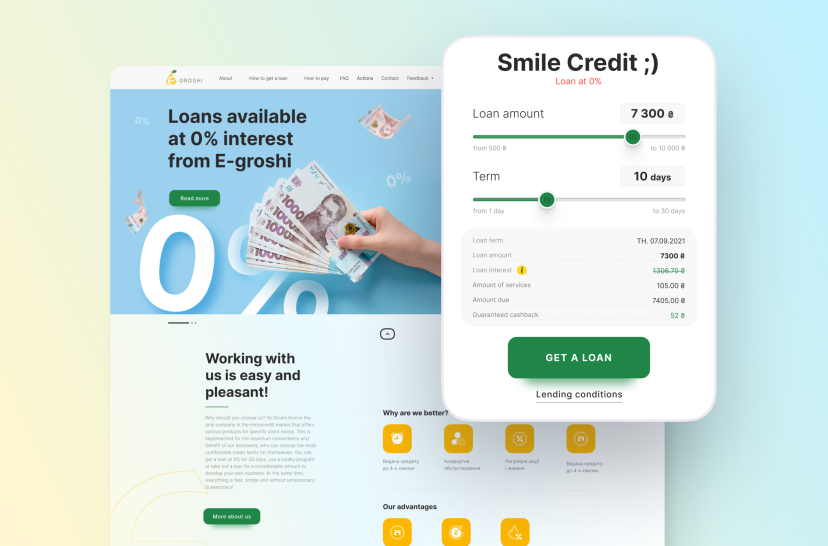
The designers find an appropriate solution in the creation of a unique design while using the corporate colors of the client brand.
Looking ahead – the new website design was created exactly on time. At the same time, our team encountered a few problems that were not an issue in getting the job done.
Results: New Fresh Site
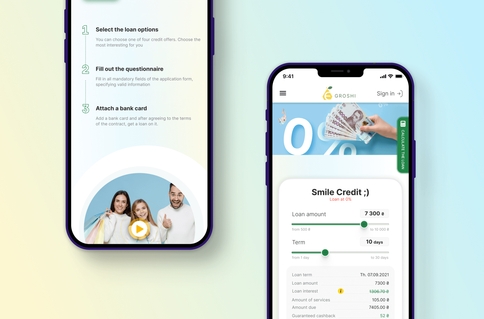
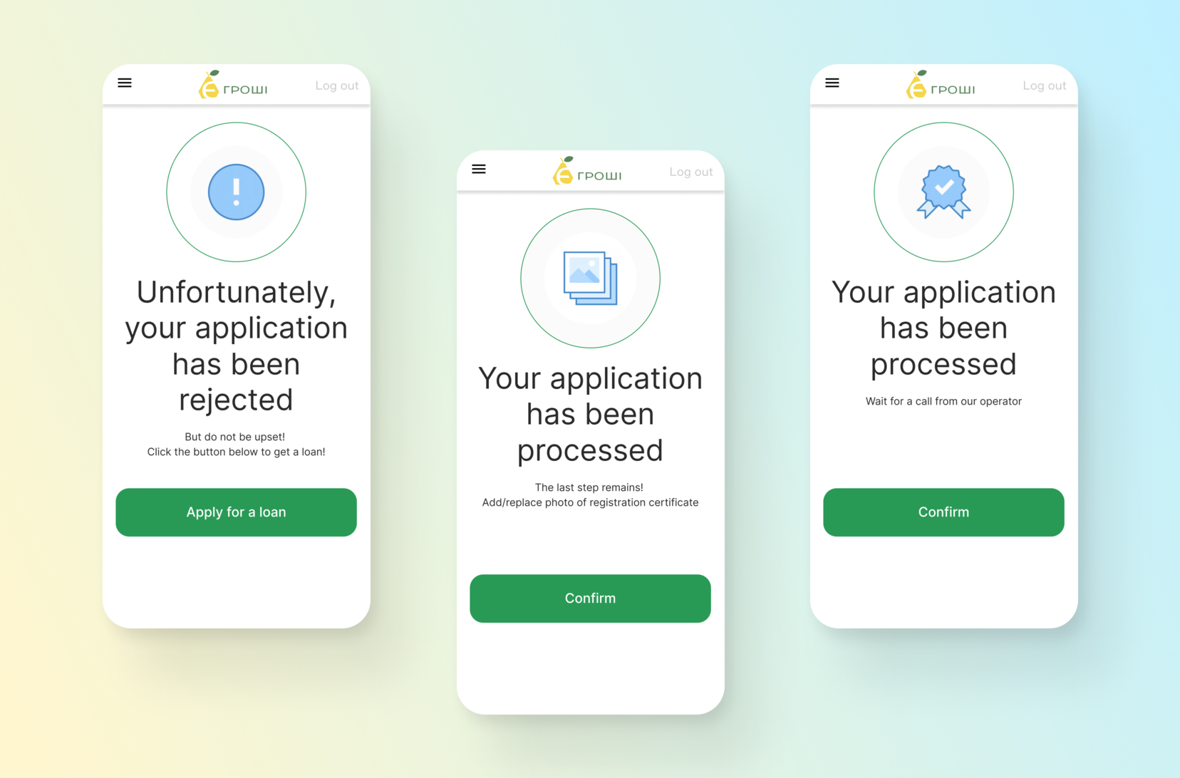
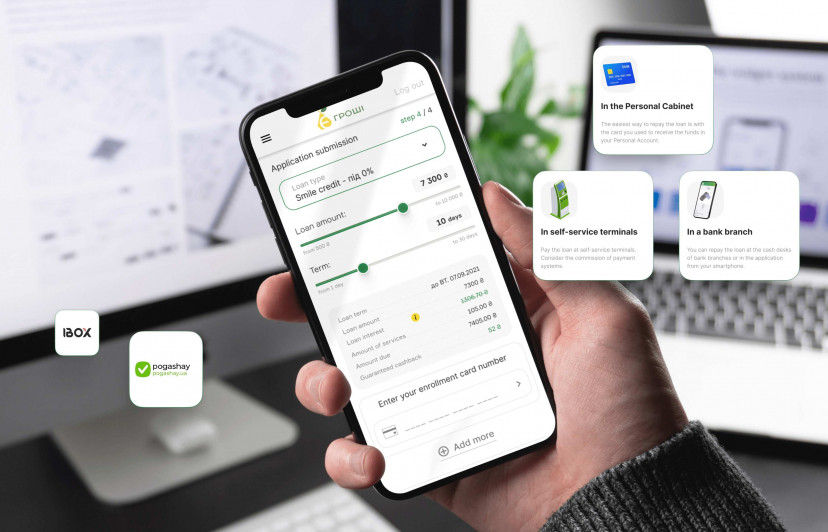
As a result, our team managed to create a unique design in the agreed timeframe of 1.5 months. We also create an individual tone of voice for E-Groshi, which is still used. Our team created a UI/UX design that was completely user-friendly for the clients of the service and was also using specific company colors. We also created a high-quality mobile version of the site. In a month and a half and in three stages, we created an updated product, which had a positive effect on the E-Groshi service.

